Connect Email by Zapier and Google Sheets to unlock the power of automation
- No credit card required
- Free forever for core features
- 14-day trial for premium features and apps
Set up your first integration
Quickly connect Email by Zapier to Google Sheets with a Zapier template.
Our most popular template

How Zapier works
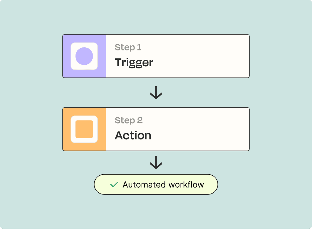
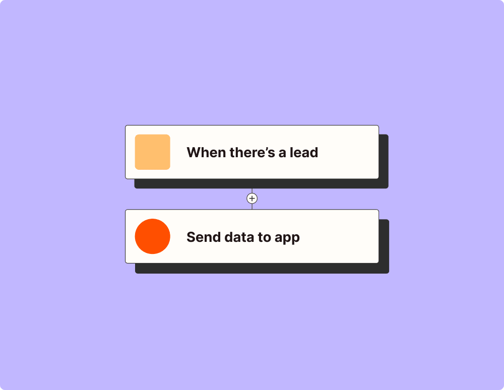
Zapier makes it easy to integrate Email by Zapier with Google Sheets - no code necessary. See how you can get setup in minutes.
Zapier is the automation platform of choice for 87% of Forbes Cloud 100 companies in 2023
93%
Customers who say using Zapier has made them better at their job
25m
Customers have created over 25 million Zaps on the platform
6 mins
The average user takes less than 6 minutes to set up a Zap
Frequently Asked Questions about Email by Zapier + Google Sheets integrations
New to automation with Zapier? You're not alone. Here are some answers to common questions about how Zapier works with Email by Zapier and Google Sheets
How do I set up a trigger in Zapier to send an email when a new row is added to my Google Sheets?
To set up a trigger to send an email when a new row is added to Google Sheets, start by creating a new Zap. Choose Google Sheets as your Trigger app and select the event 'New Spreadsheet Row.' Connect your Google Sheets account, then pick the spreadsheet and worksheet you want to monitor. In the Action step, choose Email by Zapier and select 'Send Outbound Email.' Configure the email recipient(s), subject, and body using data from the newly added row.
Is it possible to customize the subject line of emails sent through Email by Zapier when integrating with Google Sheets?
Yes, you can customize the subject line of emails sent through Email by Zapier. While setting up your Action in a Zap that uses Google Sheets data, you can map data from specific spreadsheet fields into your email's subject line. This allows for dynamic and personalized subject lines based on new entries in your sheet.
What happens if multiple rows are added at once in Google Sheets? Will each trigger an email?
If multiple rows are added at once, each entry will be processed individually if the Zap is triggered by 'New Spreadsheet Row.' Each row will indeed trigger its own email being sent via Email by Zapier as distinct events.
Can I include attachments when sending an email using Email by Zapier linked with Google Sheets?
Email by Zapier currently doesn't support attachments directly from its service. However, you can include links to files stored online (like those on Dropbox or Google Drive) within your email body as a workaround.
How frequently does a Zap check for new entries in my Google Sheet?
For free accounts, Zaps check for changes every 15 minutes. On paid plans like Starter or higher, Zaps check every 5 minutes. This means new row additions in your spreadsheet might trigger an action (like sending an email) within these timeframes.
What should I do if my Gmail account hits rate limits while sending emails with Zapier?
If you hit Gmail's sending limits while using Email by Zapier with Google Sheets, consider reducing your send volume or timing or using an alternative SMTP service configured via our Email integration instead of Gmail directly.
Can I format the data from my Google Spreadsheet into HTML before sending it through Email by Zapier?
'Send Outbound Email' through Email by Zapier supports HTML formatting. You can add styling to text such as bolding or hyperlinking within emails. Make sure that any HTML tags are correctly closed and that you're familiar with basic HTML practices for them to render properly in recipients' inboxes.
Supported triggers and actions
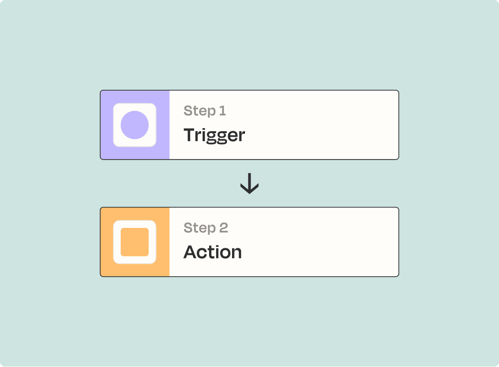
Zapier helps you create workflows that connect your apps to automate repetitive tasks. A trigger is an event that starts a workflow, and an action is an event a Zap performs.
- New Inbound Email
Triggers when an email is forwarded to your own custom
Try It - Zap_id
- Free_test_limitation
- ToRequired
- SubjectRequired
- Body (HTML or Plain)Required
- Attachment
- From_name
- Reply_to
- Cc
- Bcc
- Force Linebreaks?
- Enable read receipts?
- No_team_drive
- SpreadsheetRequired
- WorksheetRequired
Try It- Drive
- SpreadsheetRequired
- WorksheetRequired
- Trigger column
Try It
