• Home

  • Productivity

  • Productivity tips

Productivity tips

10 min read

The 5-Day Sprint: How to Jump Start a New App, Website, or Project

By Vasily Malyshev · January 9, 2018
develop-app-sprints primary img

As an app developer, people ask me all the time what to do if they have an idea for an app. Do they need to research something? Write a business plan? Hire developers? Many people don’t act on their ideas because they simply don’t know what to do next.

After designing and developing over 100 apps at Messapps for clients, we now have quite a lot of experience in starting new projects. Our process was not always perfect, and when I look back, I can see how many mistakes we made before.

Today, however, we've nailed down the start of projects by working in sprints. Our sprints are based on fundamentals of deep work, precise scheduling, and efficiency. Those sprints help us jump start any business in 5 days and put it on the rails, ready for design and development.

In this post, we'll see exactly what to do on each of the five days and how to ensure your idea is ready for smooth execution.

Editor's Note: Although this post is specifically about kickstarting a software project, you can apply the general principles to other types of projects such as designing a website or even creating a new product for a business.

Prepare for Your Project

Before the sprint begins, you'll likely need some preparation. In our case, since we are working with clients, this means we need to onboard our client and prepare all project tools.

Onboarding client has two steps. First, we send clients an onboarding questionnaire. It includes standard questions about name, email, and phone number, as well as several important business questions that are worth asking yourself about your own project, including:

  1. What is your job/occupation? Oftentimes, people come up with ideas related to what they do every day. The app they want to make might either help them improve their work, or it could be something simply related to what they are doing on a regular basis. In either case, knowing what our clients do on a daily basis gives us a better understanding of their perspective and the market we are targeting.

  2. Why have you decided to pursue this project? There are several common themes in answering this question: to earn revenue, to solve a problem I (client) face, to solve a problem other people face. The answer to this question helps us understand how to optimize the flow inside the product. This especially helps us choose the right monetization strategy (if any).

  3. What is the most important feature of the product? Most apps include lots of different features yet 90% of us use just one of those features. Therefore, it's important to understand which one is most important for your users. Will they use your ridesharing app, say, because it lets them choose a different car quality, or is it because it simply helps them get from point A to point B.

  4. Do you have any hobbies? This very much relates to the first question in the series. We want to learn more about our clients' everyday lives to help us better understand the thinking behind the app. If the app relates to their hobbies, that would also help us suggest additional features that might benefit the app.

Then, the second part of onboarding includes preparing our work tools and onboarding the client to them. There are three main tools that we use in every project:

Google Drive is our file storage mecca. We set up a new folder for each project with dedicated sub-folders for sprint, design, and development. We keep all files synced and shared between team members so that everyone can see the progress and work done.

Slack is our main tool for communication. For client projects, we create a separate channel where members of our team will discuss the project. To talk with clients themselves, we create separate Slack teams and channels for pre-development work, development work, and all additional features we are thinking of including in the next version of the app.

And we use agile project management tool Pivotal Tracker as our task manager. With the help of app automation tool Zapier, we can easily connect Pivotal Tracker with Slack and other to-do systems to automate our process. Moving forward, this allows our whole team to keep track of task progress in Pivotal while automatically responding to and creating new tasks right from Slack. Here are a couple of workflows you can use between Pivotal Tracker and Slack:

Create Pivotal Tracker stories from new Slack messages

Create Pivotal Tracker stories from new Slack messages
  • Slack logo
  • Pivotal Tracker logo
Slack + Pivotal Tracker

Share Pivotal Tracker stories on Slack

Share Pivotal Tracker stories on Slack
  • Pivotal Tracker logo
  • Slack logo
Pivotal Tracker + Slack

Now let's get started with our sprint!

Sprint Day 1 (Monday): Understand Your Business Model

Business considerations chart

Remember that building an app (or any other product) means starting your own business. That’s why before we start any project we want to make sure that it passes our “business stress test.” To do this we use our special App Business Canvas (copy the spreadsheet to use for your project). It’s a slightly modified version of a well-known Business Model Canvas, a one-page template for starting a business. Let’s go through its main components.

Questions to ask and answer before creating an app or new product:

  • Target Audience: Who are the users that will most benefit from your app?

  • Value Proposition: How does your app benefit users?

  • Platforms: What platforms will the app work on? Is there a web version?

  • Customer Relationships: How can users communicate with you? How do you prevent a bad review on the App Store?

  • Monetization: How will your app earn money? Cost to download? Freemium? Ads?

  • Key Resources: What is needed for the app to function after it is developed? For example, does your app require at least 10 drivers in each city for it to provide ride-sharing services?

  • Key Activities: What is needed for the app to function well? For example, do you check driving history? Do you ban drivers with low ratings?

  • Key Integrations: What third party work might you need? Are you using maps? Accessing a database of, for example, restaurants?

  • Cost Structure: Who will wireframe, design and develop your app? What would that cost?

Answering those questions will help you figure out some of the main issues your business might have. Each Monday, a team project manager dedicates two hours to complete this and send to the client for their feedback.

Sprint Day 2 (Tuesday): Create a User Story Diagram

On the second day, we start preparing the architecture of the app. By that, we mean creating a block diagram (see example below) with all main user stories or user journeys. We focus solely on the main user screens on this day and leave work on all secondary screens for Wednesday.

When creating a block diagram for the main user stories, follow these steps:

  1. Focus on the user’s main goal. Why did the user download your app? What do they want to do once they open the app?

  2. Try to make user get to their desired goal in as few steps as possible. Do not sacrifice quality but don’t create any additional barriers of entry. For example, if you are creating a ridesharing app and it has multiple car options, always default to one choice instead of forcing users to click and select one of the options every time. By having a default option, you save the user a tap—and the fewer taps, the more likely a user is to achieve the desired goal.

  3. Include secondary features but not secondary screens. There's a big difference between secondary screens and secondary features. Secondary screens are things like settings, login, and registration—the screens that aren’t necessarily needed by users. They are there to enable some of the experiences but they don’t bring value on their own. Secondary features, however, do. For example, adding a feature that makes it possible to order a car with a child seat is a very important secondary feature. It’s not a main feature, as the main goal is to get from point A to point B. But it's an important secondary feature because it targets an important segment of your target audience. Therefore, while we leave secondary screens for Wednesday make sure that you do cover secondary features in your user story block diagram on Tuesday.

Example block diagram for user stories

This user story diagram will function as a skeleton of your future product. Throughout wireframing, design, and prototyping you will be referring to and updating it over and over again to make sure you cover all features.

By the end of Tuesday, we will have a complete diagram of the main user stories and the client’s feedback on our app business canvas. With the canvas finalized, we send our diagrams to the client for review.

Sprint Day 3 (Wednesday): Create All the Other Screens (or Pages) Needed

Wednesday is used to create secondary screens and apply client’s feedback from Tuesday. With secondary screens we want to make sure that our block diagram has every screen that can possibly be inside the app. The golden rule is that if there is a button, there must be a screen that it opens.

For secondary screens, make sure to include the following screens in your block diagram:

  • Login screens: Would you have a simple email and password login? Maybe TouchID or face scan? How would people register if they don’t have an account?

  • Password reset screens: People often forget their password, so make sure there is a way for them to get back to their account. Also consider that some people might actually forget their email or username, so it’s good to have a way to reset those, too.

  • Registration screens: Registration screens can take different shapes and forms. They also might be almost entirely absent if you are registering through social media accounts like Facebook. But if there is additional info you need, make sure you have screens that will ask users for that information.

  • Settings screens: This group can have a wide range of screens. If you are making a fitness app, maybe you’ll have an option to switch between kilograms and pounds. If it’s a photo app, maybe you’ll want to have options to sync up with social media accounts to post photos there right from the app. Maybe you have credit card transactions in the app and need a way to change the billing info. Make sure your user has a way to change all of that.

  • Notification settings: There is a delicate balance when you are working with app notifications. On one hand, you want to send them regularly to re-engage your users. On the other, you don’t want to send them too often to annoy your user. Either way, the last thing you want is your user to not be able to turn them off and delete the whole app because of that. So make sure you have notification settings that will help your users optimize their frequency in accordance with what works best for them.

  • Terms & Conditions and Privacy Policy: Though these two are frequently forgotten if you are serious about your app, you want to make sure that it is bulletproof from the legal side. Make sure that your app has all legal documents accessible from the app and that users agree to them before creating an account.

  • Empty state screens: Empty state screens are very important and frequently forgotten screens for apps that have user generated content. Let’s say you’ve built Instagram. But currently you’re not following any of your friends. What will your feed show then? Would it just say “Nothing to see here, come back later” or will it prompt the user to add friends through a Call To Action (CTA) button?

  • Profile: Whether it’s profile of the main user or a friend that user followed, remember that there needs to be a way to see profiles of users.

  • Contact us: Make sure there is a way for users to contact you. What if they are confused? What if they want to suggest an improvement? You definitely don’t want them to go and leave a negative review on the app store.

  • Success/system popups/screens: Whether it’s a request to access user location or a message congratulating user on completing the order, make sure that you don’t forget any of those popups and screens.

By the end of Wednesday, we will have our main user stories with client feedback applied to them and we will have our first draft of secondary screens additions to the user stories. Now it’s time to send to the client for approval and move forward.

Sprint Day 4 (Thursday): Prep for Design

By the end of Thursday, we should have everything in the sprint's previous days complete and ready for the next stage. If the client had some other feedback, then Thursday should start with applying client’s feedback to user stories (both main and secondary) and then submitting for approval. If the app canvas and user stories are finalized, we move into design preparation.

With the design prep, our goal is to find the design style that our target users will like. And this is very important. One of the most common mistakes we see is when people design for themselves as opposed to their users. This leads to people designing dark apps for dating that are supposed to evoke feelings of joy, love, and wonder (spoiler alert: dark colors rarely do that). So when choosing the right design, make sure you understand what your users want or expect to see.

To prepare for the design, we send clients our design questionnaire. Among others, some of the most important questions relate to the target persona's preferences:

  • What is your target audience age range?

  • What brands are often used by your target audience?

  • Describe your target audience in 3 adjectives.

  • What emotions or feelings should the app evoke in your target audience to motivate them to use the app more?

  • Based on this color philosophy wheel, what color represents the emotions and feelings from the question above?

  • Do you think it is a good choice for the product’s main color?

  • What other color you think might be good as the main color?

  • Based on your target audience what tone do you think we should use in our copy?

  • Based on the above and anything you’ve seen before what are some of the products, apps, websites, designs that you like? Please post as many links as you want.

Note how the questions here make you focus on your target audience before choosing the color and the style. That's because, ultimately, it's your users who will make your product successful.

Sprint Day 5 (Friday): Catch Up on Unfinished Work

If you don’t want to fall behind, plan for falling behind. Have some buffer time that you can use to catch up. In our sprint, this is what Fridays (or the fifth day) are for.

Maybe that client didn’t respond on time. Maybe you were overloaded with other work so you missed out on building the block diagram. In either case, use Friday to catch up and make sure that all work in the sprint is complete and to satisfaction by the end of the day.


In just 5 days, we manage to brainstorm the business, figure out our competitive edge, create the architecture of the product, and prepare for the actual design. This puts your product in a great starting position and now all you need to do is start the actual execution.

This was a guest post from Intelogos, a performance management AI platform. Want to see your work on the Zapier Blog? Check out our guidelines and get in touch!

Title photo by photosteve101 via Planet of Success

Get productivity tips delivered straight to your inbox

We’ll email you 1-3 times per week—and never share your information.

tags

Related articles

Improve your productivity automatically. Use Zapier to get your apps working together.
Sign up
See how Zapier works
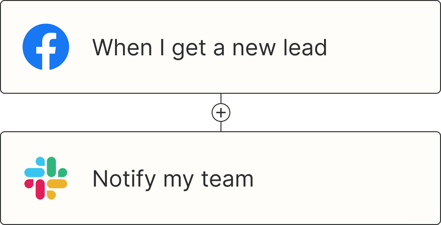
A Zap with the trigger 'When I get a new lead from Facebook,' and the action 'Notify my team in Slack'