• Home

  • Business growth

  • Business tips

Business tips

16 min read

Experts Weigh In: 21 Email Marketing Mistakes to Avoid

By Danny Schreiber · February 16, 2015

Send plain text emails. lowercase every word in the subject line. Always put the call to action as a text link and a button link.

Successful email marketing tactics are spread across the web. But even with ample resources available and advanced email marketing software, mistakes are regularly made. These blunders, however, aren't the blantantly mispelled words in the opening paragraph or the misplaced graphics that feature the wrong promotion. These are the little—and sometimes big—mistakes that are easy to overlook, but when made, could cost you email opens and click-throughs.

To prevent you from erring like everyone else, we asked marketers, startup founders and marketing executives to name the mistake that sticks out most.

What's one mistake you see email marketing campaigns make too often and how can it be fixed?

Inbox Mistakes

1. Subject Line is Overhyped

Dan Norris, Co-Founder of WP Curve

The one mistake I see is overhyped subject lines. Writing headlines is a fine art and while the BuzzFeed style baited headlines might get more clicks, people forget about the impact on the trust of their brand. When I see consistent headlines that draw me into an email with very little substance, I immediately associate the sender with spammy IM techniques and it impacts on how much I trust their brand. The style I dislike the most is when the headline implies something and when you click through, you find out that it's not the same thing. This kills trust and isn't worth the click.

It's OK to encourage people to click but if they are constantly let down when they get into your content, it will have a long-term impact. I would rather sacrifice a few clicks to maintain the integrity of my brand.

Dan Oshinsky, Senior Newsletter Editor at BuzzFeed

You

Anyone can game subject lines, and that's a problem. I did it once with a subject line that read, "Hi, You're Fired." The lead story in the newsletter featured videos of people screwing up on the job, so the subject line wasn't totally inappropriate. But the subject line was super aggressive—plenty of readers opened that email thinking they'd actually been fired! At the time, that was one of the most-opened BuzzFeed newsletters ever. But the relationship between the marketer and the sender is built on trust, and when you send emails like "Hi, You're Fired", you can lose that trust pretty quickly. Since that email, my team's had a simple policy: Always do what's best for your readers and your subscribers, and delight them with every email. Do that every time, and your open rates will be strong in the long run.

Always do what's best for your readers and your subscribers, and delight them with every email.

BuzzFeed email policy

2. Message Preview is Overlooked

Jeremy Smith, Senior Product Marketing Manager / Email Strategy at Yammer

Most clients display some preview text next to or near the subject line. This bit of text is called the preheader, and is usually limited to around 100 characters and will be pulled from the first few lines of text in your email.

MailChimp makes it easy—you just replace the text prompt they provide to make it work. Other platforms, well, they vary. ExactTarget has a bug in their built-in preheader formatting that makes it not render in most email clients, which I’ve developed a multi-client workaround for.

I’ve tested the crap out of preheater efficacy, and it can move open rates quite a bit, as you get a chance to extend your offer from just the subject line into a more detailed call-out.

Message Preview email example
An email from MediaMath opens with
Message Preview example
…but email clients show a very different preview message.

Kristin Bond, Author of Email Marketing Blog Email Snarketing

All of the little details that make up an email—from name, from email, subject line, pre-header, etc., are important. A lot of brands mostly focus on the body of the email and the subject line, and forget about the pre-header. I've seen so many emails where people still don't even have pre-header copy, or if they do, it's "To view this email in a browser, click here." Or even worse, if they're building an entire email as an image (which is bad enough on its own), the pre-header is a bunch of code or a very long URL.

Pre-headers are such a fun part of email—they can supplement the subject line, and give the subscriber more reason to open the email. They're increasingly important on mobile. They're also a great way for brands to show a little personality. For brands that use very short subject lines, they're especially important, since the character space that would go for a subject line is being used by the pre-header. You only have a few seconds to get a subscriber's attention—why not use all of the tools you have?

In this screenshot from a random section of my inbox, most of the brands used pre-header text to add more context to their subject line, but some used almost the SAME text as their subject line, and one (Dillards) supplemented a boring subject line with even more boring pre-header text. Which email would you open?

Message Preview inbox example

Ryan Hoover, Founder of Product Hunt

Email marketers often overlook the preview that's often displayed beside the subject in most email clients. This is critical to driving enough interest from recipients to open the email to read more.

3. Email Address or From Name is "noreply"

Rob Walling, Founder of Drip

Using a generic email "from name" such as "admin" or "noreply". People want to interact with people, not mailboxes.

Joe Stych, Marketer at Zapier

contact email reply

When brands send emails from a "noreply" address (or an email address that never gets checked), they're really saying "we don't want to talk to you." It's an engagement opportunity that many teams miss—on one of the largest direct marketing channels out there.

We want to make ourselves available to users who have questions about Zaiper and how to use it. So we send all of our emails from contact@zapier.com, and encourage people to reply if they're confused about how to get started. All of those replies are routed to a Help Scout mailbox, where our awesome support team puts users on a path to success.

noreply mistake

When people talk with our support team and get their questions answered, they're much more likely to turn into paying customers. If we used noreply@zapier.com instead, those opportunities would pass us by.


Email Copy Mistakes

4. Email Offers No Value to Customer

Noah Kagan, CEO of AppSumo

I see people sending follow up emails that have nothing valuable for the reader. It's cliche but anytime you sign up for a service you get a generic, "Oh, go click this and do this and just PAY US NOW!"

Instead, focus on your emails being so valuable your potential customers read them, share them and are excited to use more of your product and pay you money.

Just ask yourself if your emails are valuable even if your potential customer never buys.

Just ask yourself if your emails are valuable even if your potential customer never buys.

Noah Kagan, AppSumo

Luke Guy, Blogger and Entrepreneur

Biggest mistake I see is the fact that people cold sale within an email. Like they'll email this brand hoping they'll buy from them because of one email. Which is crazy! One email and you think you're going to land a $1,000 contract?

Complete newbie move.

Instead, people should build a relationship over time and then offer a service of some sort. So instead of being spammy, be helpful. Outreach and grow your list. You do this by offering something within every email. Content that is. Not a price tag.

Jessica Meher, Head of Marketing, Web Team at HubSpot

Not offering anything of real value. Too many emails are "me, me, me" and don't offer something the recipient actually cares about.

5. Email Focuses on the Product, Not the Customer

Matthew Smith, Creator of Really Good Emails, a Collaborative Effort of the Assembly community:

Emails should serve the customer not the product. Often times the marketing team, not the product team is in charge of the email flow and their directive is to grow. If you get myopic about that task you forget that the most solid growth comes through simple, repeatable, service that is so good it's sharable. Serving customers comes by meeting them in their email client with simple tasks and giving them more than they expect or more than they are paying for with their time.

This email by Squarespace does this well.

Squarespace email

This email by Home Depot fails at this.

Home Depot email

6. Email is Void of Personality

Paul Jarvis, Bestselling Author and Web Designer

The biggest email marketing mistake I see people are guilty of is not letting their own personality shine through. Just because you're selling something doesn't mean it needs to sound like "Marketing-Bot-O-Tron-3000" wrote it. People probably signed up for your list because they liked your unique voice, your point of view, the way you do things that isn't the same as everyone else. So when you've got something to do sell them, for Pete's sake, keep your personality and voice shining through.

Sandi MacPherson, Founder of Quibb

There aren't enough companies telling interesting, relevant stories to their users. People are interested in hearing about your company, or at least your perspective on what you're best at, along with the people behind the product that they enjoy using. Using social cues and proof in products is a well understood approach, yet people don't take it as seriously in their email marketing strategy. Anand Sanwal at CB Insights does a great job at this, where he shares his personal opinions on interesting news, asks email subscribers to email him directly with their opinions on that news, and also shares interesting tidbits about what him, the company, and other users are up to. Spitfire Athlete's emails are also great at this, sharing the stories of various successful athletes they're partnering with to encourage users to reach their own fitness goals.

7. Email Contains Too Many Calls to Action (CTAs)

Georgiana Laudi, Director of Marketing at Unbounce

Marketers often try to do too much in one campaign email (presumably because they don't want to have to send more than necessary in fear of unsubscribes). Trying to accomplish too much in an email is asking readers to do too much work to decipher if your email is relevant or not to them. One CTA linking to one landing page (too, with one CTA) clarifies your offer and makes it easier to convert.

Ellie Mirman, Vice President of Marketing at Toast

One of the biggest mistakes I see in email marketing campaigns is that there isn't a clear goal or call to action. Too often, email marketing is treated as "something we have to do" without much thought about what goal it's trying to achieve. Email marketing can be used to generate leads, engage customers, drive blog subscribers, or any number of other relevant goals. Email newsletters are often the worst offenders of this—they are crammed with content without much clarity on what the marketer hopes to get out of sending that email. Some of my most successful email campaigns have been simple, with a single piece of content and clear call to action to download.

Here's an image of an email that does this well:

HubSpot email

Chris Litster, Senior Vice President, Sales and Marketing at Constant Contact

While most businesses send email campaigns with a good idea of what they want people to do, they don’t always make it clear to the reader. Email recipients should know what you want them to do right away. Think about the action you want them to take. Do you want them to visit your website, redeem an offer, register for an event, or visit your store? Make sure they have all the information they need to take that action and make it as easy as possible for them to do it.

Paul Jarvis, Bestselling Author and Web Designer

The biggest email marketing mistake I see is a lack of focus. Just like if a website has 50 calls to action, 30 blinking buttons and a navigation that's longer than "War and Peace", it's not going to convert or retain any visitors. The same applies for each, the more focus there is on ONE idea, ONE call to action, ONE task for a user to complete, the more likely they are take that action.

Kristen Craft, Director of Partnerships at Wistia

Here's one mistake a see a lot: giving people too many calls-to-action in an email. It's confusing to the recipient and dilutes the effectiveness of the email campaign. Plus, it makes it harder to gauge the effectiveness of the email, since you don't have a single metric you can look at (like click through rate).

Instead, give people a single CTA, and ideally, give them one that's super compelling (like watching an awesome video!). A video thumbnail as your CTA is likely to give you 3x the number of click-throughs (versus any other CTA). For example, I'm pasting below an email we sent last summer, inviting people to our office. Very simple, clean, and with just one CTA for a fun video. (Side note: do not include the video itself in your email. This can lead to some bad outcomes! Use a clickable thumbnail image that automatically redirects to a landing page with the video on it.)

Wistia email

Related: "The Surprising Way One Startup Increased Email Click-Through Rates By 300%

8. Email Doesn't Supply a Text Link

Bryan Harris, Founder of Videofruit:

People still like text links. Be sure to include one above the fold and one below the fold. And ALWAYS put them on a line by themselves.

9. Email is Too Long

Dean Levitt, Chief Of Culture at Mad Mimi

I often see people spending hours, even days, crafting long emails filled with many topics, ideas and news that would need a minimum of 10 minutes of uninterrupted reading to get through. While they often look amazing, they simply don’t get the results an email marketer might want. These monster emails lower your engagement and worst of all, they suck up your time and energy and become a chore.

Avoid turning email marketing into a chore by doing the following:

Keep it short and simple! Pick a goal and write a simple, short email that leaves the reader in no doubt what their next step is. It should be engaging, fun to read but most of all, it should take a few moments to grasp and act. If you’ve got a lot to get off your chest, send short emails more often.


Email Formatting Mistakes

10. Email Contains a Personalization Faux Pas

Jason VandeBoom, CEO and founder of ActiveCampaign

email personalization fail

I often see basic personalization issues. If you can't get the basics right it's not a good sign. Nothing feels less personal than seeing a personalization tag (such as %PRODUCTID%) within a received email. Already know that the vast majority of email is automated, but there is a certain level of trust that is lost when this happens. Any decent marketing platform will allow you to send test emails that utilize full personalization rendering so that you don't have to risk it.

11. Email is Only Images

Jessica Meher, Head of Marketing, Web Team at HubSpot

Using all images as the entire email. It's typically not mobile optimized. Entire content doesn't appear if someone's settings are "images off"—and what happens if the image links break! Sometimes not clear what's clickable, and image-heavy email can be considered spam by filters. Looks like a giant ad.

12. Email Doesn't Use any Images

Bryan Harris, Founder of Videofruit

Use at least one image inside of each email. Every split test I've done shows that people are MUCH more likely to click and image as opposed to a text link.

13. Emails Miss Out on Power of Plain Text

Diana Smith, Director of Marketing at Segment

Don't underestimate the power of the plain text email! Sometimes nicely designed emails for newsletters and product updates can increase conversion rates. But, for your first onboarding email, try a short, plain text note coming from a real person on your team. Ours has a 60 percent open rate!

Popular style of designed welcome email:

welcome email
welcome email example

I'd want to test those against something that looks like this:

plain text email

Email Frequency Mistakes

14. Emails are Sent Inconsistently

James Clear, Writer and Entrepreneur

Simple: Not being consistent enough. I think once or twice per week is perfect, but you can't miss. Show up every week.

15. Too Many or Too Few Emails are Sent

Ros Hodgekiss, Community Manager at Campaign Monitor

Overall, one of the most frequent mistakes we see email marketers making is underestimating, or overestimating the frequency with which their subscribers wish to hear from them. And this is backed up by the numbers - according to a 2013 survey, 53% of consumers reported getting too many emails from retailers, while only 44% said they get the right amount.

Campaign Monitor stat

There are simple ways to get around this issue. First of all, you can have your subscribers submit their email frequency preferences - either on subscribe, or later, via an email preference center or similar. Once you have sufficient data, you can segment accordingly. This approach puts the power into your subscribers' hands. Secondly, you can periodically survey your subscribers to find out more about them - which I recommend anyway, for reasons beyond simply learning how to become a better sender. Finally, there are some great studies out there on ideal email frequency, including one we did internally that suggests that sending every 2 weeks is the sweet spot for subscriber engagement.

Any which way you do it, you can certainly benefit from less unsubscribes and more clicks and opens if you pay attention to what email send frequency works for your subscriber lists.

16. Email Messages Overlap One Another

Christopher Lester, Vice President of Sales at Emma

Lately, I've noticed a lack of coordination in my inbox. Multiple emails from the same online retailer in the same day, often with contradicting offers — meaning I had to navigate all the messages to figure out how to get the best deal on that lamp I’d had my eye on. This multi-email trend was at its peak during the holidays, and with all the hustle and bustle of the season I found myself unsubscribing from brands that I have known and trusted for years. I think the lesson is to send with your reader’s needs in mind instead of with your own business objective as the goal. It’ll pay off in the long run.

17. Emails are Effectively Pointless

Robbie Mitchell, Head of Marketing and Communications at Knewton

Dumb: vacation properties (e.g. hotels) sending recurring newsletters promoting local deals. I stayed at a hotel once for a wedding, or went on a honeymoon to a remote location, and they keep offering me deals to come back. I am never going back.

18. Email is Rarely—if Ever—Sent

Wade Foster, Co-Founder and CEO of Zapier

Zapier collected 10k emails on a pre-launch list and we didn't send them a single email until we launched. That was 10k stale email addressed that could have been nurtured and loved. Our launch could have been much more successful had the email list been nurtured. So despite my hesitancy to send an email that wasn't a launch email, I should have found something valuable to keep those people up-to-date on at least a monthly basis.


Email List Management Mistakes

19. Emails Keep on Coming

Neil Patel, Co-Founder of Crazy Egg, Hello Bar and Kissmetrics

Most companies keep emailing the same people over and over again. Normally this isn’t a problem, but a lot of people won’t open your emails. By emailing the users that aren’t responsive, it will cause some email providers to start pushing your emails in the spam box as they are assuming you are sending junk emails based on your low open rates.

In order to prevent your emails from going into the spam box, don’t keep emailing people who aren’t opening up your emails.

20. Email List is Never Segmented

Tommy Walker, Marketing at Shopify

There isn't nearly enough focus on segmentation or subscriber feedback.

For example, if you're a site that offers beginner, intermediate and advanced level advice and you ask me to sign up for your email list, you should be using what you know about me (like the page I signed up on) to send messaging that is in line with the "skill level" that was indicated by the page I signed up on.

Or, let's say you have a piece of software. At the very least, alter your communications with your low, average, and high use customers. Not all customers or readers are equal, so don't treat them as such.

Not all customers or readers are equal, so don't treat them as such.

Tommy Walker, Marketing at Shopify

Also, it's not uncommon for email marketers to do a quick "getting to know you" survey for new subscribers, but what about a similar survey 3,6,9 and 12 months down the road?

Not only will this give your subscribers the impression you're actually interested in what they have to say, but it also gives you a gauge qualitatively of how you're performing, and how you could be doing better.

Erik Harbison, Chief Marketing Officer at AWeber

If you’re not segmenting your email list, then you’re probably using terms like ‘blast’ and think email is dead.

Getting the email with a discount for the product you just purchased. Receiving updates on a version of software that you didn’t download yet. These are the signs of a poorly segmented list and great reasons you’ll click the unsubscribe button.

Even sending a one-question survey can help gauge an interest, want or need of your subscriber. This can only help you determine a better approach for your content, sending cadence and expectations.

Segmenting on basics like geography or origin of sign up may help with developing the right messages and content, but should only be considered the start.

When you factor in deeper actions like purchase history, activity levels with your product/service and content downloads, then you’re able to significantly strengthen the relevancy and maximize the one-to-one relationship that email provides.

21. Emails Don't Follow Customer Behavior

Jimmy Daly, Head of Content at Vero

The biggest mistake I see all the time is marketers ignoring behavior.

Here's what I mean. You see a lot of promotional email, lots of newsletters, etc. That's the easiest place to start with email marketing so people focus on it. Then, you get lots of content around optimizing subject lines, writing better copy, when to send emails, etc.

We're missing the point!

Email marketing campaigns should be sent as a direct result of data and behavior. If a user is inactive, they get a nudge to come back. If they are active, they get emails about features they haven't tried yet or inspiration to engage at an ever higher level.

Data-driven lifecycle email is so, so, so powerful. And I believe it's where most businesses are missing the boat on email.

For bloggers and information marketers, segmentation is key to data-driven email. If you can't track behavior via an app or e-commerce store, you need to do it directly in your email marketing software. Here are a few ideas to start with:

  • Send new subscribers an onboarding email series. Focus on content that you know converts. (In this case, "conversion" could mean encouraging a reader to download an e-book, opt-in to a membership area or simply read more content.)

  • Find the people who consistently open and click your emails and send them VIP content or give them early access to new content.

  • Send simple (but awesome) behavioral email. For example, if someone requests an e-book and you deliver it via email, you are nearly guaranteed an open. Build on that momentum by moving them a step closer to your next goal (an online course, webinar, newsletter subscription) by including a clear valuable proposition and a strong call to action.

Matt Hodges, Senior Director of Marketing at Intercom

(The mistake of...) Not considering your audience. It's like writing a love letter and then addressing it "to whom it may concern." Businesses do it all the time; I've lost count of the number of emails I've received from a company where I have literally no clue who they are or what they do.

Intercom email

What's the fix? Send well-targeted messages to the right customer at the right time in the right medium. Intercom shows us who our customers are and what they do in our product, and lets us use this live data to segment audiences for campaigns–based on location, in-product behavior, etc. Check out a blog on the topic from our co-founder Des Traynor, "A Simple Improvement to Product Mails".

Rob Walling, founder of Drip

Drip email

Sending the same email to all of your subscribers. If you aren't customizing individual emails (and which emails people receive) based on a person's opens, clicks and actions they perform on your website, your competition will. The days of one-to-many email marketing are rapidly coming to a close. The future will be won by those who embrace one-to-few and one-to-one email marketing.


The Worst Mistake

Required Login to Unsubscribe

Robbie Mitchell, Head of Marketing and Communications at Knewton

Worst: requiring login to unsubscribe (aka "manage subscription preferences"). As a result, I just mark as spam instead. Bad for everyone.

Image credits: Frustrated photo courtesy Oliver Newport. Screenshots courtesy respective individuals. HubSpot email example via HubSpot blog.

Get productivity tips delivered straight to your inbox

We’ll email you 1-3 times per week—and never share your information.

tags

Related articles

Improve your productivity automatically. Use Zapier to get your apps working together.
Sign up
See how Zapier works
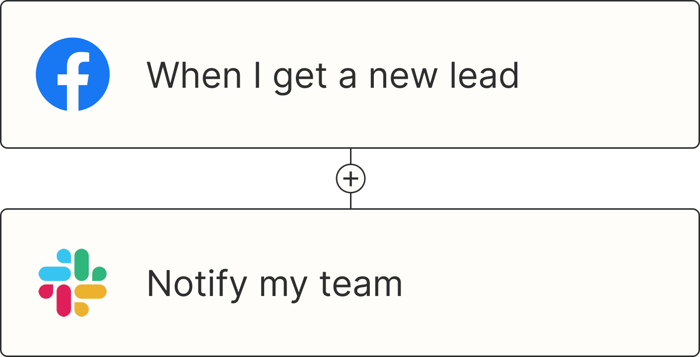
A Zap with the trigger 'When I get a new lead from Facebook,' and the action 'Notify my team in Slack'