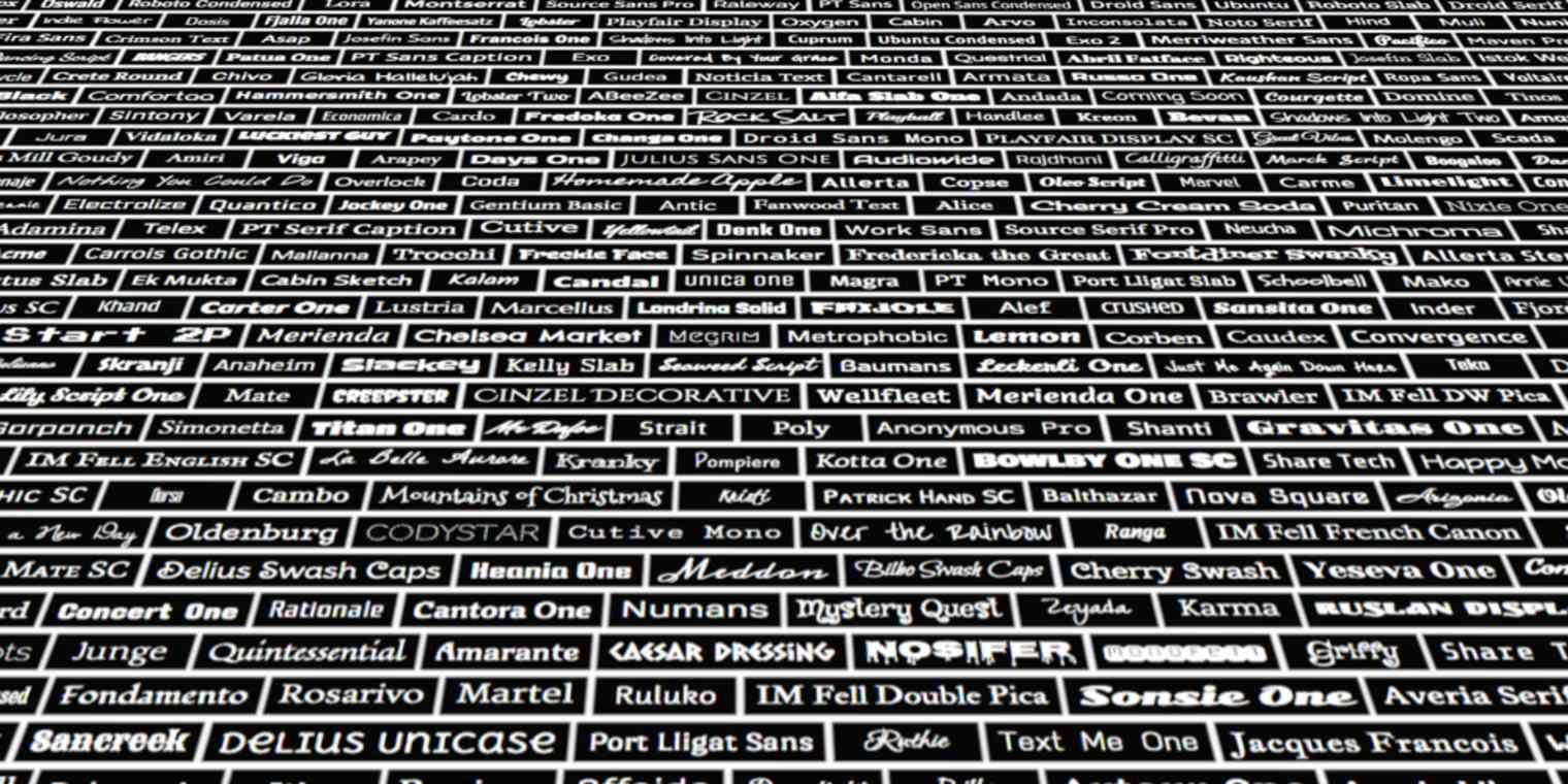
Fonts spark extreme emotions. We may not know a font's name or even notice its use most of the time, but we know when one is wrong, and when it's just right.
The Helvetica typeface is so beloved an entire movie was made around it; Comic Sans, on the other hand, is hated so much there's a campaign to ban it. And when Apple or Amazon change the default font on their devices, the internet goes wild with with both praise and hate.
Fonts evoke feelings, associations, and moods. They communicate. As Kanye West—who was recently the inspiration for a $50,000 font called Yeezy Display—said to students at the Art Institute of Chicago: "I get emotional about fonts."
That's why it's worth worrying about the fonts on your website.
The Web Font Revolution
There's thousands if not millions of typefaces, ranging from ancient hand-cut wooden type to modern digital fonts. But on the web, until relatively recently websites were limited to using Georgia, Verdana, Arial, and a handful of other "web-safe" fonts.
CSS2 introduced support for web fonts in 1998, but it took years for them to be widely adopted. Today, though, the average website you visit is likely using web fonts. You could still just use Arial or Georgia and play it safe, but for a nicely designed site that reflects your brand and style, you'll need web fonts.
CSS: (or Cascading Style Sheets) is a style sheet language for describing the design of a webpage (or eBook, or any document really). It's used on all modern sites to choose the fonts, colors, and other design elements used.
But fonts are still pricey. Depending on how you're planning to use it—on a website, in an app, or elsewhere—a single style of a single font can cost anywhere from $35 to $350, or even more. If you go with one of the popular font hosting services, like Typekit, Fontdeck, or Webtype, you'll be renting fonts for anywhere between $7.50 and $40 per year—sometimes per font.
That's where Google Fonts comes in. It's a completely free font hosting service with more than 700 fonts in a variety of styles and weights. And it's more than just a basic font service; it includes offers powerful features, too, including:
A growing number of scripts with non-roman characters, including Arabic, Cyrillic, and Hebrew
An easy-to-use Font Browser, which will help you find the perfect font
A speedy, reliable CDN (or content delivery network) that serves the fonts to your site fast
Option to select just the font weights you need for optimum load time
Here's your primer on picking the right font, using Google Fonts to track it down, and embedding the font on your website (whether it's on Squarespace, WordPress, or another hosting service).
Choosing the Right Font
Typography is a vast and complex subject about which many (beautifully laid out) books have been written--the classic of the field is Robert Bringhurst's The Elements of Typographic Style (which also has a free web adaptation!).
But let's just look at the basics. Here are a few simple best practices to keep in mind when choosing and using fonts.
Think About Communication and Context
When selecting a font, start by thinking about what the font should communicate. Is the goal to catch a visitor's attention with a bold, quirky choice like Megrim? Or would you rather reassure them with a font that feels stable and strong like Arvo? Do you want to convey a casual attitude with something like Annie Use Your Telescope, or perhaps or hint at luxury with Monoton? The correct font depends on your message.
Before you start looking, brainstorm a few keywords describing the tone of your project. As you browse, think about how each font you view interacts with those concepts.
This focus is important because it can be easy to get distracted by flashy yet impractical options when scrolling through a vast list of fonts. For example, one of my favorite Google Fonts is Press Start 2P, a display font inspired by classic video games.
But it's so aggressively stylized that it distracts from everything else on the page. And because of its geeky, game-centered connotations, there aren't many professional contexts in which it would be appropriate. Use it in an email news blast promoting a networking event at that cool bar with old arcade games? Sure! But for a heading on a corporate landing page, or the menus in an app? Not so much.
Fonts are fun, but pick one that tells the right story about your message.
Find Fonts that Work Together
The most common mistake for web font newbies is getting drunk on power and setting every element on the page in a different font. This leads to chaotic layouts that are amateurish and hard to navigate.
In 99.9% of cases, you only need two fonts: one for body text and one for titles, headings, and other design elements.
Fonts come in two main flavors, and you'll likely pick one of both:
Serif fonts have small lines or "feet" attached to them, which make them easier to read on a line. Fonts with serifs are better for the body of your website, and have a more classic look that'd fit well in an old bookstore.
Sans-serif fonts—literally "without" serifs—will help titles and headers on your site stand out, but they'd be more difficult to read as body text. Sans-serif fonts look more modern, and are often used in the menus and interfaces of programs.
Don't worry—Google Fonts lets you filter by serifs and sans-serif styles, so it's easy to track them down.
There's a third type of font—Monospaced fonts—that look like type from a typewriter. In a monospaced font, each character has an equal width, making them perfect for accounting or coding, but not so great for website design.
Instead of overloading on fonts, choose just a couple fonts then use their weight, styling, sizing, arrangement, spacing, and color to create contrast between page elements. You'll be amazed at all the different things that just two fonts can do—the example above only uses one!
Trying to find two fonts that work well together might seem difficult, but Google helps out with that, too! When you find a font that you like, click on the "Pop Out" button to open the font's info page in a new window (this is also an easy way to set aside fonts you want to come back to later).
Click on the "Pairings" tab on that page, and you'll be presented with examples of your chosen font paired with other fonts that Google thinks will work well with it.
Want more combinations to choose from? Check out Fontpair, a site that showcases font pairs from Google Fonts that look great together. Or, try out Typecast, a free web typesetting tool with Google Fonts integration, which I used to create some of the mockups and examples in this guide. Just click the "Try in Typecast" tab to open the font there for further experimentation!
How to Use Google Fonts
With an idea of the font style you're looking for, it's time to start scouring Google Fonts. Here's what you need to know to get started.
Searching Google Fonts
Google offers 700 free fonts (that's a lot). Luckily—as you'd expect from Google—the site has excellent search tools to help you find the ones you want. The font browser is comprised of three sections:
The current set of selected fonts
Filters for narrowing down your font selections
Options for viewing your font in different styles and contexts
Narrowing Down Your Selections
The toolbar to the left of the selected fonts has a series of options for honing in on the fonts you're looking for. As you adjust them, you'll see the current set of selected fonts change.
Click the "Category" drop down menu to choose a broad category of font: Serif, Sans Serif, Display, Handwriting, or Monospace. (I'll cover some of these terms as we go on, but if you'd like a fuller primer, check out this crash course in typography)
Below the category selector, there are a set of sliders to narrow down font selections based on thickness, slant, and width.
Not all fonts are available in scripts other than the Latin alphabet, so to only see fonts in an alternate character set, use the "Scripts" drop down.
Narrow things down too much? Click "Reset all filters/search" to start over again.
Viewing Fonts in Different Contexts
Still can't decide which font you want? A font can look radically different depending on the styling (bold and italic) and weight (how thick or thin the characters are). In the toolbar at the left, click "Show All Styles" to see every version of the fonts you're browsing—some fonts only have one style, while others have more than ten.
We'll explore a more customizable, interactive way to see your fonts in action later, but, for now, you can also use the tabs across the top of the screen to quickly resize and visualize your selected fonts in a variety of common web contexts.
Is Google's default text about "grumpy wizards" distracting? Click on the "Preview Text" form field and you can enter whatever text you want. Trying to find the perfect font for a page title, for example? Enter that title here and see exactly what it'll look like in a given font!
Packaging Your Fonts
Okay, so now you know how to choose a typeface responsibly, and you've hopefully found some fonts that could work well for your purposes. Now, how do you get them from Google Fonts to your website?
When you find a font you want to use, click that font's "Add to Collection" button.
That will bring up a menu at the bottom of the screen—you'll see the name of the font you added listed there. Scroll or search through the font browser and add any other font you'd like to use in the same way.
Once you've got the fonts you want, click the "Use" button in the Collection tab. You'll be taken to a new screen where you can build your package.
Building a Font Package
Building a font package consists of choosing the styles and character sets that you want to use in your project. You'll see all of the available styles and character sets listed with check boxes beside their names—check the ones you think you'll use.
Be sure to watch the effect of your choices on your page load gauge, though! The more styles and character sets you add, the longer it'll take for your page to load.
That's why it's worth thinking through how you'll use these fonts on your site. If you're only using the Sans-serif font for headers, you likely only need one weight if you won't be using italics or bold text in headers. And for body text, you may only need the regular, bold, and italics weights—the thin weight would be far too small for your blog posts and content.
Putting Your Google Fonts To Use
You've found the perfect fonts, packaged them up, and now they're ready to beautify your website. Here are four step-by-step guides on adding your fonts to any website, a Squarespace site, a WordPress blog, or your MailChimp account.
Want to use your new fonts in documents and presentations too? You're in luck. Google Docs includes each of the fonts from Google Fonts. Just open a document, click the fonts menu, select "More Fonts," then add the fonts you just selected to your Google Docs menu for easy access.
Add Google Fonts to Any Standalone Website
There's different steps for adding Google Fonts to various publishing platforms, but, but at its core, using a Google Font (or any web font, really), requires two simple steps:
1. Adding the HTML Link
After you select your styles and character sets, Google Fonts provides you with HTML code linking to the fonts you've chosen. When someone visits your site, this code will tell their browser to where to download the fonts as the page is loading.
To use the code, you'll add it as the first line inside the <head>
tag of your page or site. Don't worry about it breaking your layout or looking out of place—<head>
content is invisible to visitors, so only the browser will see it. In your HTML editor, it'll look something like this:
<!DOCTYPE html>
<html>
<head>
<link href='https://fonts.googleapis.com/css?family=Open+Sans:400,700|Cabin+Sketch' rel='stylesheet' type='text/css'>
<title>Your website</title>
</head>
That <link href='https://fonts.googleapis.com/css…
line is your Google Fonts link, which tells the web browser to download those fonts when loading your website.
2. Setting the CSS
Once you've added the HTML link, your fonts will be loaded with your page, but you still won't be able to see them. Why not?
Because you haven't told the browser to use them! In order to do that, you need to add what's called a CSS declaration. CSS is a scripting language that's used to tell browsers the specifics of how they should display web pages—in this case, it tells the browser where to use the awesome fonts you've chosen.
To do so, you'll add the "font-family" declaration that Google Fonts gives you to the CSS classes or IDs for the content you want to be displayed in the font. If you want every word on the page to be displayed in the Open Sans font, for example, you could use the CSS wildcard by writing:
* {
font-family: 'Open Sans', sans-serif;
}
But usually you'll want to target your font selections more specifically than that. Not sure which classes or IDs should feature which font (or not sure what a class or ID even is)? Learning how to write and edit CSS is beyond the scope of this guide, but there are lots of great free resources for learning about CSS on the web (I recommend the fun interactive tutorial at Codecademy).
Add Google Fonts to a Squarespace Site
Squarespace makes it easy: Google Fonts is actually built in! That means when you you click on a Typography drop down in the Style Editor, you'll see some great choices from Google Fonts.
However, Squarespace only curates a short list of popular fonts in their "Font' drop down and that's what the majority of users will choose from.
You, on the other hand, now know that there are way more Google Fonts available! Use the Font Browser to find your own unique font, then type the name of the font into the search box on Squarespace to use it on your website. Here's an example of a Squarespace site using the Press Start 2p font I showed you earlier.
Add Google Font to a WordPress Blog
Using Google Fonts with WordPress is also really easy—you can go to the trouble of embedding HTML code and editing CSS as I discussed above if you want, but it's much faster and easier to install a plugin that'll do all of that work for you.
I recommend Easy Google Fonts, which is easy to install by following the instructions here. Once it's installed, you'll have access to the full set of Google Fonts from your Admin Dashboard. As with the Squarespace example above, it's often easier to find the fonts you want in the Google Font Browser and then select them within your WordPress Style Editor.
While you're at it, don't forget to use some of Zapier's WordPress integrations to automate and speed up your work in WordPress.
Use Google Fonts in a MailChimp newsletter
Using a Google Font in a MailChimp newsletter is a little more complicated than using it with Squarespace or WordPress, but at this point, you're basically a Google Fonts expert—you can totally do it! It just requires getting your hands (metaphorically) dirty with a little HTML and CSS.
First: Using a MailChimp Theme?
If you're using one of MailChimp's awesome themes for your newsletter template (or if you used one of them as a starting point for your own), you'll need to export the template and then reimport it in order to gain access to the HTML and CSS code you need to add your custom font. For this guide, I'm going to use one of MailChimp's "Event" themes.
To export a template, click on the drop down menu to the right of the template's name in the list, then choose "Export as HTML." The template will be saved to your browser's default download folder.
Then, to import that same template back into MailChimp for editing, you'll click the "Create Template" button in the upper right corner of the Template page.
Select the "Import HTML" option and upload the template that you just exported. It'll open up a live preview of the template with a code editor for changing the HTML and CSS.
FYI: once you export and import a template, you won't be able to use MailChimp's drag and drop template editor on it. For this reason, I recommend testing out your font selection on a copy of the template to see if you like it.
After you upload the theme, MailChimp will show you a live preview on the left side of the screen and the code editor, which contains the template for the newsletter. In the Code Editor, you need to repeat the two steps we discussed earlier: adding the HTML code and setting the CSS.
1. Add the HTML code
Let's use the Cabin Sketch font from the font package we put together earlier in this guide to give our newsletter title a little more flair. Copy the line of code that Google Fonts gave you:
<link href='https://fonts.googleapis.com/css?family=Open+Sans:400,700|Cabin+Sketch' rel='stylesheet' type='text/css'>
Remember that we want to add our HTML code right after the <head>
tag in the template. So, right here:
We'll make a new line and paste the code in, so that it looks like this:
2. Setting the CSS
The next step is a little trickier. We need to find out the CSS ID of the title element so that we can change its font. How do we do that? Well, we know that the text for the title is "banana summit."
The phrase should be wrapped in an html <div>
tag with the id "emailHeadingBottom." So, now that we know that, all we have to do is find the CSS entry for "#emailHeadingBottom" (in CSS, "#" means "ID")—once we find that, we can change our font declaration!
Here's the CSS entry, from up near the top of the template code:
You can see that under the ID, there are a number of lines of CSS describing particular parameters assigned to this ID. Even if you don't know CSS, a lot of these are pretty recognizable. It's clear that font-weight: bold;
means that elements with this ID will be rendered in bold type and that font-size: 72px;
means that they'll have a size of 72 pixels.
The declaration we want to edit is font-family
—we'll replace the existing CSS with the CSS that Google Fonts gave us for Cabin Sketch, so that it reads:
Click Save and check the live preview:
Success: the font is changed to Cabin Sketch! But something looks a little off—it seems too thick and dark. What could the problem be?
Look at your CSS—could anything there be causing this issue? It's probably that font-weight: bold;
declaration. Remove that line:
and check the live preview again:
Much better! The font looks clear now. This is a great opportunity to experiment with the CSS to get the perfect layout. For example, if you edit the line height and add a small margin to the element, you'll get a cleaner layout:
Play around with different fonts and styles until you get the perfect mix of attention-grabbing and clear.
Power Up Your Web Pages with Google Fonts
Congratulations—you now know a bit more about web typography, and have learned how how to use Google Fonts to set your designs apart with some basic CSS. Make sure to use your new superpowers with care and wisdom!
Letterpress image courtesy of Kyle Van Horn on Flickr