Every day, millions of tasks run through Zapier. Each one represents a moment saved, a process improved, or a goal achieved.
At Zapier, we ship fast to get lots of cool new things to users as quickly as possible. But as designers, we couldn't help but notice that quality sometimes fell behind—from slow load times and jumpy transitions to disconnected workflows and unnecessary clicks. We'd been shipping, shipping, shipping without making enough time to polish.
While we love shipping new features that help you do more, you've consistently reminded us that it's often the smallest improvements that make you feel truly unstoppable. A clearer error message. A smoother page load. A smarter way to organize your interface. These moments of polish show care—both for the product we're building and the people who use it.
"These moments of polish show care—both for the product we're building and the people who use it."
That's why this October, we launched what we're calling "Happy Zapping"—a dedicated week where our entire product team paused all big feature work to focus on just one thing: the quality-of-life improvements you've been asking for.
And thanks to all your thoughtful feedback, we knew exactly where Zapier could be better.
The result: Dozens of carefully crafted updates that smooth rough edges, reduce clicks, and make your automation journey more enjoyable. From faster troubleshooting to smoother navigation, these improvements touch every nook and cranny of Zapier. Each change might seem small on its own, but together they represent our commitment to making every interaction with Zapier a happy one.
Here are the improvements we're most excited to share. Happy Zapping! 😄
Watch the recap
See Bryce's favorite enhancements from Happy Zapping week.
Smoother, more organized Zap + account management
Managing dozens (or hundreds) of Zaps shouldn't mean starting from scratch every time you visit your dashboard. That's why we're excited to introduce saved views for your Zaps page—your preferred filters and sorting options now persist exactly as you set them.
Whether you want to see the your folders first or keep certain integrations at the top, your workspace stays organized just the way you like it.
But staying organized is about more than just filters. We also shipped these improvements:
Finding connected apps is faster with improved pagination. If you're automating with your team, your personal connections will appear at the top, so finding what you need is faster.
Quick-access links help you browse Zaps by app or connection, making it easier to audit and update related workflows.
Team management is more intuitive with new sorting options by name and last login.
Faster, more connected troubleshooting
When something goes wrong with a Zap, every click between spotting and fixing the problem matters.
Now, you can edit errored steps directly from the Zap run—no more jumping between pages to make those crucial fixes. Plus, we've added direct links from Zap History to the exact step that needs attention in the editor, getting you to the solution in one click.
Because time spent troubleshooting is time away from your real work, we polished these features too:
Your selected step stays highlighted when navigating between runs, helping you keep your place.
Error messages are clearer and easier to read with improved styling. Plus, you can spot errors more easily with redesigned error icons in the editor.
The trigger step automatically opens when you navigate from History, getting you started faster.
Test your Zaps more thoroughly by replaying up to 50 runs at once.
More efficient Zap building
You shouldn't need to repeat yourself to build a reliable Zap. Now you can copy and paste entire error-handling branches between steps, dramatically reducing the time it takes to create robust backup plans across your Zaps.
Here's what else we've improved to speed up your building process:
Run Zaps with a polling trigger, right from the published view.
Navigate between steps, even in Focus Mode—maintaining your concentration while moving through your Zap.
See entire field names—even the long ones—thanks to an expanded mapping dropdown.
Set up conditional logic faster with our redesigned boolean field.
Start with the perfect view of your Zap thanks to adjustable initial zoom levels.
Faster performance across Zapier
Nothing disrupts your flow like jittery UX. We've completely revamped how pages load across Zapier, especially on your Zapier dashboard. Content now loads smoothly without shifting or jumping, making the entire experience feel more polished and professional.
Speed matters everywhere, so we also shipped these improvements:
The Chatbots editor loads significantly faster, getting you to a finished AI assistant sooner.
The universal sidebar stays steady with reduced layout shifting.
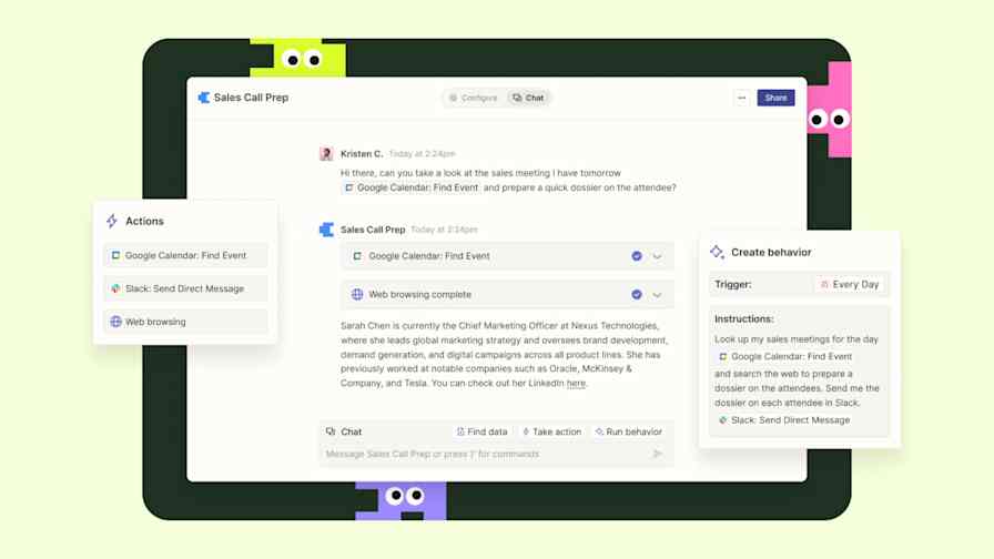
In Central, it's faster than ever to test out behaviors for your assistants.
All page transitions are smoother throughout the app.
The entire interface feels more responsive and snappy.
Better multi-product integration
Building a chatbot with a knowledge base used to require bouncing between products. Now you can create a new table for your FAQs right from the Chatbots editor, streamlining your setup process and keeping you focused on what matters—creating great conversational experiences.
We've made these additional improvements to help your products work better together:
Notifications from your AI assistants in Central pop up our Google Chrome extension, so you can keep tabs on automation from anywhere.
CSV exports from Tables now include helpful metadata (like record ID, created date, and last updated date), making your download more useful.
Edit table rows directly in your interfaces with a single click.
Get smart suggestions for your buttons in Tables automation with Copilot-powered buttons
Enhanced team collaboration
Keep your automation knowledge in the team with new Functions sharing capabilities. Now, you can share any function you build with teammates, ensuring everyone can benefit from automation. Plus, you can now set public-facing names for your Interfaces while keeping your internal naming conventions—perfect for sharing with external users.
And because great teams need great tools, we've added:
Bulk email updates for enterprise teams to streamline admin tasks.
Improved team member sorting and filtering to find the right person faster.
Enhanced analytics dashboard for enterprise users to track team performance.
Streamlined notifications
Keeping track of notification settings shouldn't require endless clicking. Now you can see and manage all notification frequencies from a single view, giving you complete control over your Zapier updates at a glance.
To keep you better informed (but not overwhelmed), we've also improved:
Notification override management for better control.
Metered billing notifications for clearer charges.
Error notifications to help you spot and fix issues faster.
Not sure where to start?
Finding the right Zap template shouldn't feel like searching for a needle in a haystack. To get the gears turning, we've got a template library where you can find complete systems for whatever you're trying to accomplish—with more multi-step examples pulled from real customer solutions. Whether you're managing leads or automating your marketing, you'll find templates that match the way you work.
Explore the template library to level up your automation game
These improvements represent countless small moments of delight we've added to your daily Zapier experience. While each update might seem small on its own, together they make your automation journey smoother, faster, and yes, happier.
Happy Zapping!