• Home

  • Business growth

  • Business tips

Business tips

15 min read

The landing page guide: How to promote your product on one web page

By Matthew Guay · January 5, 2021
landing-page-guide primary img

In the beginning, websites were all landing pages, simple one-page sites that provided links to other pages on the same server or on the internet. What we call landing pages today are much the same, only they now include images and video, contact forms and signup buttons, widgets and social media feeds. Websites have turned into apps of their own.

Instead of a dozen or thousand pages competing for your attention, a landing page features just one main message or point. It's the best way to launch and promote your next new idea, capturing and tracking your best marketing leads or providing the most straightforward way for your contacts to, well, contact you. That's why you need a landing page to launch your next product.

  • What is a landing page?

  • Website vs. landing page

  • What should my landing page include?

  • How should I make a landing page?

  • Automate your landing page

  • Test and analyze your landing page


What is a landing page?

Apple and Alto
Apple

Landing pages are often broadly defined, from the Oxford dictionary saying they’re "typically the website's home page" to Wikipedia saying they're "a single web page that appears in response to clicking on a search engine result." That makes it seem like if you have a website, you have a landing page.

Not quite. Landing pages are actually individual web pages designed to promote one product or service and capture leads that are interested in it, with stats and analytics to help you see how your page is performing.

Let's break that down. Imagine you're promoting an upcoming cookbook to people who love pasta. A landing page would be perfect to focus your marketing on noodle lovers. It would include details about your book focused on noodles, perhaps with a sample noodle recipe or a video that shows your noodle techniques. And most importantly, it would include a signup form where people would sign up to know when your cookbook is launched. Those people are your leads, people you know are interested in pasta and your cookbook and are more likely to buy your book if they read your emails.

What's a lead? A lead is someone who's interested in your product enough to take some action—fill out a form, email you, or try a product demo. A landing page is a great way to find new leads and start convincing them why they need your product. Learn more in Zapier's intro to leads guide.

Your main website could do that, but a custom-designed landing page could do it far better since it's just one page focused on a single request or directive. Like the Alto’s Odyssey page above, there’s only one thing to do—in your case, sign up for your emails; in Alto's, to download their app.

And you could repeat that and market to other audiences. Say your cookbook also includes salad recipes. You could make another landing page for veggie lovers, complete with a sample salad recipe and a green color scheme. People who sign up for your emails here are equally interested in your book, this time focused on the salad recipes.

That's one of the best things about landing pages. As Moz says, they’re "a page that focuses information targeted towards a particular user." You can customize your landing pages to focus on one precise audience and market directly to them.

Carrd landing page templates
Landing pages apps help you quickly build a one-page site and create new versions of it for specific audiences (Carrd pictured)

By virtue of their focus, landing pages bring a number of benefits:

Focus. This is the main reason to create a simple page that promotes your product or service to a specific audience. When you target your page on one product for one audience, it's easy to cut out the stuff that would otherwise distract from what your audience is most interested in. Your company might make a dozen things, but on this page, in this place, you want people to focus on one core thing.

Speed. With such a small scope, it's far faster to build a landing page than most websites. Really—the best landing page builder apps let you make a site in around five minutes, as long as you already have graphics and copy ready. A landing page builder app is the fastest way to get a web presence for your idea.

Flexibility. Besides selling a product or service to a targeted audience, landing pages can also help you get signups for an event, gather new subscribers for your email newsletter, get people to download your app or eBook, and any other single thing you want visitors to do. They can even help you validate an idea. Say you want to write a cookbook with dessert pasta recipes and wonder if anyone would buy it. A landing page for people who love both pasta and dessert is a great way to test out your idea.

Customization and optimization. Want to make different, customized versions of your entire website? That'd take weeks of work at best. With a landing page, though, you can often make a new version of your page in minutes. Most landing page builder apps let you copy a page, make the changes you want (say to make the salad and pasta focused variants of your cookbook site), and publish the new versions instantly. Then, you can use A/B testing to make small changes—say, to make your signup button red on one version of your landing page and green on another—and track the statistics to see which one works better.

Search. Ads and word-of-mouth are great—but ideally, people will discover your product on their own, too. They'll search for "dessert pasta," and your page will show up near the top. With a page focused on that keyword, you have the chance to be the top result Google shows when someone searches for that phrase. That's because there's nothing else but that topic on that webpage.

Conversion. Most importantly: Landing pages get visitors to do the thing you want on your site—fill out that form, download your newsletter, book tickets, attend your event, get in touch. Compare that to a generic website homepage, such as Apple's homepage, which has a lot of options. Perhaps you need to buy an iPhone case, so you go to apple.com and suddenly are tempted to check out the new iPhone and iMac. Maybe you watch a commercial for another product, and before you know it, it's time for lunch, and hey, you can buy a case another day.

With your landing page focused on one topic, you’ll know that everyone who visited your site was interested in the topic. That makes tracking stats easy, and when you dig into your site analytics and see the search keywords that brought people to your site, you'll know exactly how to customize your page and make it convert even better.

Once you've set up your landing page, make it work for you with automation. Here are 4 automatic workflows to get the most out of your landing page.


You're in a hurry to get something online. You want to keep people’s attention on one thing. You want to get them to do something specific. And you want people to find and share your page easily. That’s why you want a landing page.

Website vs. landing page

The terms are sometimes used interchangeably, but websites and landing pages are two different things—and choosing the right one can make all the difference. At GyanDevign Tech, Rahul Gulati and his team have worked with many small business owners to help them understand which option is best for them. Here's how he summarizes the difference:

  • A website is like your toolbox. It represents your entire business and includes navigation, multiple calls to action, informational resources, a blog, and more. Designing a website requires a web design strategy, testing and monitoring the conversion rates, and making adjustments.

  • A landing page is one tool in your toolbox. It's intended for a particular purpose (e.g., promoting one product, registering for an event, signing up for an email list). By removing the excess information and offering only one call to action, it can lead to much higher conversion rates. It won't do as well for SEO, though.

Your decision will be based on your objective: what are you trying to do?

The target of a landing page is simple: convert the visitor. Whether that's getting them to purchase something, sign up for something, or just click through to something, the purpose of the landing page is conversions. If you only sell one product, a landing page might be all you need. Otherwise, landing pages usually accompany your website for a specific purpose—a promotion, and event, something like that.

A website, on the other hand, allows your user to convert, but it's also there to contextualize your business, show what you have to offer, and display the breadth of those offerings.

What should a landing page include?

Next Draft email newsletter
Next Draft

You've seen dozens if not hundreds of landing pages—and odds are you've subscribed to or bought something from one recently. What made that page work? For multi-page websites, sometimes it's the repeated exposure that gains customers as a form of brand marketing. You click through enough pages about the new iPhone and watch enough of their commercials, and eventually, your existing phone seems like it could use an upgrade.

Your landing page has to do the job far more quickly. A focused landing page describes and sells the reader in one go. For that, you need information and a call to action—something you want the reader to do.

Start with the information. Some sites keep the content focused. Next Draft, an email newsletter, has a landing page that says it'll give us the day's most fascinating news—and that's it. Scroll down, and you'll see quotes from prominent individuals—people at CNN, the New Yorker, and Lifehacker—telling why they like Next Draft. It's social confirmation, a nudge that says, hey, these other smart people think this is great and you might too.

Alto's Odyssey, a mobile game pictured alongside Apple above, does something similar on its landing page. Its site shows a graphic from the game, a video of the game in action, and quotes from game reviewers.

Salesforce webinar signup

Salesforce takes that a bit further in its landing page for an upcoming webinar. It gives you info about the webinar and the people who will be speaking in it—then gets you to register for the event.

Koya Bound
Koya Bound uses 5,000 words to promote a book with scarcely any words.

Or you could include more information. Far more. Koya Bound, a photography book, features far more content than even your average blog post. In over 5,000 words, dozens of pictures, and an animated map, it tells the story behind the photography book. It's almost a product in itself—one that also makes you want to purchase the book.

Quartz Obsession
Quartz Obsession shows the full newsletter inside the landing page

Quartz Obsession, an email newsletter that shares a fact of the day, combines the two approaches (and yes, it's a page inside a complete website, with a menu at the top—but this page focused enough to be a good example). It quickly describes the product then shows the actual product right there with a full copy of the email newsletter you can scroll through. You could do something similar by including a video of your product, or a full-sized photo of it, or a sample chapter of your book, or anything else that helps readers get why this thing is worth their attention.


There are dozens of other examples you could find (One Page Love is a great place to start), but let's break down what your landing page should include from these examples:

  • Product details: Something focused that describes your product in the most direct way possible. Your elevator pitch.

  • Graphics and/or video: Something that shows your product and backs up the copy.

  • A call to action (CTA): Something the reader can do, typically a button to buy your product or a form to sign up for an email newsletter or more information. Or both—you could have a Buy button for people ready to purchase, and a Learn more form to gather leads and get people you can market to further.

  • More details: Something more to make your product seem interesting, including quotes from others who like your product for social proof, additional features or product description, and perhaps details about your team and why you made this thing.

Put all of that on one page, keep it simple, organize it in an easy-to-understand way, and you'll have a great landing page.

Tip: As your website grows and if you eventually add more pages, keep these ideas in mind for your site's homepage. It's still a landing page, and still needs a strong focus on your product and what you hope visitors will do on that page.

How to build a great landing page

Instapage screenshot
A landing page builder helps you quickly build a one-page website without coding (Instapage pictured)

The first thing you should open when making a landing page is a writing app. No, don't design your website there. Do write and tweak and perfect the copy that will go on your site, though. After all, you only have one short area to sell your idea to a visitor and get them interested. Your copy is the main thing that will do this.

Like the example landing pages above or the product pages on most companies' sites, your landing page should include your product's name, introduces the product, and perhaps expand with more details to explain the rest.

Say you're promoting Zapier's Introduction to APIs book. You might write "Download Zapier's latest book" as the headline, and describe the book's contents in three or four sentences underneath.

Then, get everything else together that you want to feature on the page. A photo or video of the product, perhaps. More text in the form of quotes or reviews from others. A sample chapter or a document about your organization's beliefs or a demo of your products' results. Anything else you want to include on the page.

Finally, think about personalization. If you're promoting a cookbook with a landing page focused on pasta lovers, what colors and graphics come to mind first? What are people interested in pasta recipes Googling? And what's different about that audience's interest from those who love salad? You'll want your landing page to reflect those insights. And depending on your landing page builder, you can use dynamic text to replace text with your visitor's search query. If they search for caesar salad you could replace your landing page's mentions of salad with the exact type of salad they're interested in.

Now it’s time to start building. You have a few options. You could code your landing page site, but that's the slowest and most difficult option. A far better option is to use a landing page app—and we've rounded up the best landing page apps to help you choose. These apps help you make a landing page in minutes.

With a landing page builder app, you'll select a template, then click on any item in that template you want to change and replace it with your content. You can type text in as you would in a word processor, and drag-and-drop everything on the page to the spot you want. The top part of the page likely works fine as-is—add in your content, and it's ready to go. Then, to include reviews or demos, add extra elements further down the page from the app's toolbars. And when you finish, publish the site to share it with the world.

Already have a full website? You could build your landing page there. In a WordPress-powered site, for instance, you can add a page to your blog that includes only the content you want. That will still likely include your website's menu, header, and footer links—which makes it more distracting than a dedicated landing page—but it is a quick way to create a new page using an app you already have.

Either way, there's one final thing always to include: Your CTA. Your landing page might do a fantastic job at showcasing your product, but without something for users to do, it'll be far less impactful. The two best options are to include a button to purchase your product or a form to sign up for emails about your product.

The former—like the App Store button on the Alto's Adventure site above and the Gumroad button on the Koya Bound site—are a great way to promote a product that's for sale elsewhere. If you are selling a movie on iTunes, a book on Amazon, an app on the App Store or Play Store, or even if you have a dedicated eCommerce site elsewhere, you can include a link to your product so visitors can purchase it directly.

The latter is the slow approach, but it'll likely get more direct conversions (or the number of people who do something on your site rather than visit it and leave). Signing up for emails works for existing products, ideas like petitions and groups where there isn't anything to buy, and even upcoming products where you want to tell people when your product comes out. It's a small ask—you have a field that asks for their email and lets them opt into (or say they want to receive) your emails. You can then add them to your email newsletter to remind them about your product, or send drip emails that give you a chance again and again to sell your product's best features. And eventually, hopefully, they'll buy.

There's one final thing to consider with your landing page: its domain. By default, most landing page builders will give your page a subdomain on their site, like yoursite.theirapp.com. That works—but the best option is to have your domain, so you can tell people to visit yourproduct.com to see your landing page. If you're in a hurry or on a tight budget, a subdomain is fine; otherwise, it's best to upgrade to a unique domain for your landing page. That's one more way to keep your page focused and un-distracting.

→ Learn more about leads and how to turn them into customers in Zapier's Lead Guide.

Automate your landing page

MailChimp Automated Email
Many landing page builders can send automated messages to leads (MailChimp pictured)

Now that your page is built, it's time to think about what to do with your new leads. You want every visitor to your landing page to fill out the form so you can get in touch. That's where you can start converting these visitors into customers.

Sending everyone a personal note won’t work if your landing page is a hit. You can only write so many emails and SMS messages yourself. So automate things.

Many landing page apps include a drip email tool to send automated messages to new subscribers. Once you make your landing page and form, you can add a customized email that thanks people for signing up, shares more info, and pushes them a bit closer to buying your product. Make unique emails for each audience—remember, your pasta and salad subscribers each are interested in something slightly different. Then do it again. Most automated email tools let you add an entire workflow of emails, SMS messages, and more to stay in touch with your new contacts over time for basic marketing automation.

Or, you can build your own automated workflows using integration tools like Zapier. Want to save new leads to a spreadsheet and your CRM app, then send them an email the day after they sign up, and finally mail them a print thank you card if they make a purchase? That—and any other workflow you can dream up—are all possible. Here are some popular ones to spark your imagination. Or you can take a look at our full roundup of landing page automations.

Send emails when there are new Unbounce form submissions

Send emails when there are new Unbounce form submissions
  • Unbounce logo
  • Email by Zapier logo
Unbounce + Email by Zapier

Subscribe new KickoffLabs signups to Drip

Subscribe new KickoffLabs signups to Drip
  • KickoffLabs logo
  • Drip logo
KickoffLabs + Drip

Send Unbounce submissions via Twilio SMS

Send Unbounce submissions via Twilio SMS
  • Unbounce logo
  • Twilio logo
Unbounce + Twilio

Notify a Slack channel when a new lead is added to Wishpond

Notify a Slack channel when a new lead is added to Wishpond
  • Wishpond logo
  • Slack logo
Wishpond + Slack

Add or update HubSpot contacts for new submissions on Unbounce

Add or update HubSpot contacts for new submissions on Unbounce
  • Unbounce logo
  • HubSpot logo
Unbounce + HubSpot

Test and analyze your landing page

Unbounce A/B Test Screenshot
Many landing page apps let you run A/B tests to see how different version of your site compare (Unbounce pictured)

Your landing page launched—but it's not finished. In fact, few things are ever entirely done, especially on the internet. There are always things you can tweak. A landing page's focus gives you even more room to hone and perfect.

The first place to start is with A/B testing. Often used to test email layouts and designs, the basic idea of A/B testing is to have two copies of the same page with one tweak on one of the pages. Say your Subscribe button is red, and you wonder if more people would click on it if it were green (seeing as green stands for go, at least while you're driving). You would make a copy of your landing page, change the subscribe button to green, then show the page with the red button to half of your visitors, the one with the green button to the other half, and check your stats to see which one performs better.

As you're testing, keep in mind your goal. Do you want people to sign up for something, or share the page, or purchase your product? Work towards those goals to make your landing page a success.

Many landing page builders like Unbounce include tools to A/B test automatically. They'll let you copy the page and make the change, and then will split up your audience for you. Once you've finished one test and decided which works best, you can change one other thing and see how that performs. Only change one thing at a time, though—otherwise, you won't know which change made the difference.

And be creative. Try everything. Does a buy now button get more clicks or a subscribe form? Does a round price work better, or one with .99 at the end? Does a photo or video get more subscribers, or more or less copy?

Another option is using a heatmap, an overlay on your page that shows where visitors moved their mouse and clicked the most. Tools like Instapage include this by default, or you could potentially add a third-party tool like Crazy Egg to track this separately. Then, see what people do on your site, and use that to run new A/B tests and optimize your landing page further.

As Seth Godin said: "Landing pages are not wandering generalities. They are specific, measurable offers. You can tell if they're working or not. You can improve the metrics and make them work better." Your page is likely great already. With a bit more work, you can make it even better. It’s where your readers will land—and with luck, where your product will take off.


You’ve done it—you've built a new webpage for your product or marketing campaign. It was likely far easier than you might have thought it'd be. One page focused on one product can be rather quick to put together. And with a bit of work to optimize your text and make it easy for people to take action on your page, your landing page can be the key to turning your product into a success.

For that, though, you'll need to do something with your followers. If your site includes a signup form, you’ll need to send emails, stay in touch, and ensure no one forgets about your site. Here are the tools you need:

  • Send great email newsletters to your followers with these best newsletter apps

  • Automatically send the same emails to everyone who signs up on your landing page with these best drip email apps

  • Learn: What is a squeeze page?

  • Compare landing page builders head to head: ClickFunnels vs. Leadpages: Which should you choose?

Aircraft photo by Pixabay via Pexels.

This article was originally published in April 2018, and was updated in January 2021 with contributions from Rahul Gulati.

Get productivity tips delivered straight to your inbox

We’ll email you 1-3 times per week—and never share your information.

tags

Related articles

Improve your productivity automatically. Use Zapier to get your apps working together.
Sign up
See how Zapier works
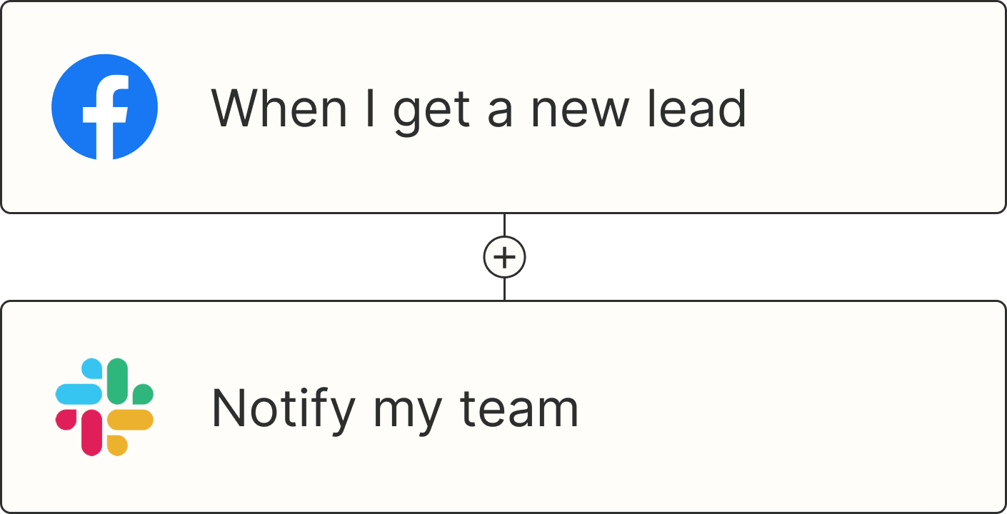
A Zap with the trigger 'When I get a new lead from Facebook,' and the action 'Notify my team in Slack'