• Home

  • Business growth

  • Business tips

Business tips

8 min read

4 Skills Designers Need to Help Companies Succeed

By Bryan Landers · February 26, 2015
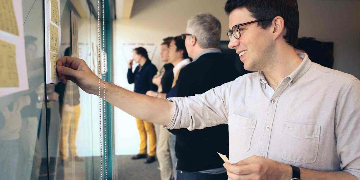
startup-designer-skills primary img

Early on in Braden Kowitz's role as a design consultant for startups, he met with a founder in their "scrappy" office conference room. The founder said, "I care about great design and I want to have great design in my company."

Kowitz enthusiastically proffered a logical next step: "Why don't you hire someone? I've interviewed like a 100 designers, I can help you with this!"

"Well, you know, we don't have headcount."

"Ok, well, how about you hire an agency?" Kowitz suggested.

"I don't really have the budget to hire an agency. They're pretty expensive."

"How about you hire a freelancer? They could come in for 1 day a week, maybe…"

"You know, we don't even really have the money to hire a freelancer."

This was the world we lived in 5 years ago. The founder was attracted to the idea of "great design", but lacked sufficient evidence to feel confident backing that desire with actual company resources.

Today, design is often a core value at companies large and small. Excellent in-house design teams at startups now compete with prestigious agencies for creative talent. Companies like Pinterest and Airbnb illustrate the rise of the designer founder who weave design focus and process into the DNA of their companies. Even in small five-person technology startups, teams will likely have at least one designer.

One of the longest-running designer gripes—"we don't have a seat at the table"—is no longer true. Kowitz is at the forefront of designers asking the question: "We have a huge ability to impact these companies. What are we going to do?"

Kowitz, a design partner at Google Ventures, offered a challenging answer to this question during a talk he delivered in December 2014, at 500 Startup's WARM GUN conference. His presentation, "Designing Startups", highlights four skills essential to designers who hope to impact the success of companies.


Great Design is Not Enough

Inspired by WIRED's magazine to web evolution, 37signals (now Basecamp) showing that simplicity can be a feature, and even today, 10 years later, the enviable polish of products like Path and Square, Kowitz works hard to do great design work.

His refrain became: "How can I get my company to ship beautiful design?"

But, design alone is not sufficient to drive success. Lovable products like TiVo, with delightful experience details right down to the sound design, have fallen short of expectations. Compare two mobile apps in the same space—their outcome does not reflect a meritocracy—the best design does not always win. Products with brilliantly executed design may fail to gain market traction, and products lacking design polish sometimes become hugely successful. Kowitz conceded that, "Great design can't solve a broken business model."

"Great design can't solve a broken business model."

If we question our motives for caring about shipping great design, do we discover a desire to please customers? A failed company with great design has no customers. Kowitz bravely confesses the true motivation is ego. He's not alone in his desire to impress friends with craft at the highest levels; communities like Dribbble reveal the need to create a world of beautiful things regardless of needs served or business sustainability. But, is using a company as a stage for your craft what you want to do with the designer's seat at the table?

"I think I had it a little bit backwards. It wasn't about how we can ship great design here. The real goal is: how do I use my skills as a designer to build a great company?"


Levels of Design: Surface or Core

Having worked toward that goal of business success on design projects with over 100 companies, Kowitz and the Google Ventures design team have gained invaluable experience and learning.

Typically, when they begin working with a startup, questions from founders are focused on the upper-levels of design: visual and interactive.

The Surface of Startup Design

Can you make our logo look better? Can you make our product simpler? Can you make it more beautiful? Can you reduce friction?

This is logical. Designers are good at delivering those things. But, startups have limited money and time to achieve sustainability. Asking founders, "What keeps you up at night?" or, "What are you really worried about?" prompts questions about the lower-levels of design: product and process.

The Core of Startup Design

Why isn't our product growing faster? What should the next features be? Do we have the right team? Are we doing the right things day-to-day?

Design can help answer these questions, too. Kowitz has discovered four skills that designers need to have if they hope to focus on the core of design.


1. Know Where To Dig

Know Where To Dig slide

Resist the urge to do the easy things (name the company, design the logo…) Instead, Kowitz encourages you to do the harder, more important, things first: map the problem, pick the risky part, and design to learn.

Map the Problem

"How are you gonna get out of a maze until you have a map?"

Available tools:

  • Business model canvas

  • User journeys

Pick the Riskiest Part of the Problem

Designers gravitate toward the surface-level, but those are the riskiest things that might cause your company to fail. Does anybody need your product at all?

Design to Learn

Test the riskiest thing by doing only what is necessary to learn if your hypotheses are true or false and iterate rapidly. To test product need, you don't need to design the company's brand—you can simply test the value proposition, which might take only a day to prepare.

This learning will give you confidence to move forward and the details uncovered by interacting with real customers will help you prioritize which features to build and which to not build.

Eventually, if the product is working, you will get work on the fun stuff—the cute animated character designed to delight your customers.

"As a designer, when you're working at a startup, it's much more about the learning than it is about the execution. It's about doing the risky stuff first and then doing the fun stuff last."


2. Get Dirty

Get Dirty slide

For the product that became Cluster, the Google Ventures design team first built a fake mobile app using Flinto, an iOS and Android prototyping tool. Their prototype at this stage was "smoke and mirrors" using static images and barely more than shaded wireframes to simulate the experience. Working at this fidelity is painful for designers because it's obvious how the design could be improved. Yet, it's all that is necessary if the goal is to learn.

Don't Under-Polish

"Do not do paper prototypes unless what you're delivering to customers is paper." There are better tools built to simulate a product experience.

Don't Over-Polish

"Don't make something beautiful and spend all that time unless what you're trying to measure is how good your beauty is."

Designers, who care so deeply about craft and quality, find this difficult. Kowitz has come up with several "hacks" to stay at the right level of fidelity.

Get Dirty breakdown slide

Pick the Right Tools

Photoshop encourages polishing, while tools like Keynote or Omnigraffle make polishing impossible and encourage you to think more in terms of customer stories and flows, which tend to be more important in product success.

Focus on Workflows, Layout and Copywriting

This helps designers avoid a myopic focus on smaller details and, when tested, will teach you the most about the concepts being delivered to customers.

Use Templates and Libraries

Don't reinvent the wheel. Save time wherever possible.

"It may not be the best icon—it may not fit with all the other stuff that you're doing—but if user understands what that icon means, it's fine. You can polish it up later."

Available tools:

  • Keynotopia

  • The Noun Project

  • Stock photography sources

Create Deadlines For Learning

Given enough time, designers, as Kowitz himself admits, will "polish a turd". In taking a bad idea and trying to make it look beautiful, you will only grow more attached to it and waste time.

Google Ventures design boldly schedules customer interviews whether or not they're ready. Force yourself outside of your comfort zone.


3. Pump In Fresh Data

Pump in Fresh Data slide

"Nothing will kill a project faster than not having the right data."

Founders tend to be confident about what they know, which can be dangerous early on in a startup. The human brain is a pattern matching machine—we see faces in the lumps of dirt on Mars! The optic nerve even blocks vision where it meets the eye, but our brain resolves the blind spot such that we never perceive it.

To avoid blind spots, Kowitz injects data into projects by performing customer interviews. His team performs them about every two weeks and these user studies are scheduled at the start of design projects before anything has been designed. This keeps the team moving quickly toward the goal of learning.


4. Take Big Leaps

Take Big Leaps slide

When you know where to dig (the riskiest things), get dirty (prototyping to test those risky things), and inject data (putting those prototypes in front of people very early on), it will help your team take large risks safely. The pressure to succeed is reduced because you're not launching publicly, you're testing in a safe "prototyping sandbox."

"You feel more confident in the things that work, so that you're not taking small leaps with your whole company. You're going to do big things."


Case Study: Blue Bottle Coffee

Google Ventures Blue Bottle Coffee Case Study

Blue Bottle Coffee, a highly praised coffee roaster and coffee house, was moving from selling coffee only in their successful physical locations to also selling online.

Know Where to Dig

The riskiest thing to test was that the design and experience of the Blue Bottle website would lead to sales. The 20 different coffee roasts available presented a challenge in getting customers to make a selection with which they'd be happy.

Get Dirty

After observing how all existing coffee stores (including Starbucks) sorted roasts by geographic location, the Google Ventures design team did research and built prototypes to test the success of this organizational solution.

Pump In Fresh Data

Interviewees sheepishly admitted, "I don't know the difference between Columbian and Guatemalan coffee." While coffee sellers were comfortable sorting by geography, doing so didn't actually help customers make a purchasing decision.

Take Big Leaps

This unexpected learning enabled the team to begin testing superior solutions, like asking customers how they brewed their coffee at home. Breaking from industry standards is a big move, but when backed by data, Blue Bottle can be confident moving in a new direction.


Case Study: SaviOne

Google Ventures SaviOne Case Study

Savioke's SaviOne product is a robot that brings hotel guests conveniences, like shampoo bottles or toothbrushes, upon request.

Know Where to Dig

The Google Ventures design team grew to love the robot and wanted hotel guests to experience a similar emotional attachment. But this was a risky proposition because the beloved robots of cinema (R2-D2, WALL-E...) have set high expectations for real life robots—the SaviOne prototype didn't even have a microphone to react to voice input.

"We were worried about this. What would happen when people saw the robot the first time?" Kowitz recounts.

Would they be annoyed that a human wasn't making the delivery? Would they feel marginalized?

Get Dirty

A clever working prototype was fashioned out of an iPad strapped atop the machine with a simple, cute face rendered in the UI in addition to buttons hotel guests could press to give feedback. They figured out how to drive it manually with a PlayStation controller.

Pump In Fresh Data

To test reactions, five travelers were scheduled to visit a hotel room and call the front desk to ask for a towel or similar item. From the building across the street, the team watched video streaming in from cameras placed throughout the room as their prototype robot showed up at the door.

The results: everyone loved the robot!

Take Big Leaps

The experience tested so well that Savioke launched the product with a refined version of this concept. The bold design helped get favorable press attention and the experience has gone on to inspire people to share unsolicited videos of their joyful reactions to the little robot.


Take Big Leaps Savioke slide

Kowitz believes designers can now make a choice: continue to work on the surface-level or take a risk and start working on the core of companies. With a seat at the table, it's a great time to be a designer.

"If we change what we do to focus a little bit on the core, we can have an even bigger role in shaping the success of our companies."

Zapier, a remote company with team members around the world, is hiring a lead product designer.

Credits: Braden Kowitz's talk video courtesy 500 Startups. Braden Kowitz's slides and hero image courtesy Kowitz.

Get productivity tips delivered straight to your inbox

We’ll email you 1-3 times per week—and never share your information.

tags

Related articles

Improve your productivity automatically. Use Zapier to get your apps working together.
Sign up
See how Zapier works
A Zap with the trigger 'When I get a new lead from Facebook,' and the action 'Notify my team in Slack'