• Home

  • Productivity

  • App tips

App tips

6 min read

7 ClickUp features you should start using

By Nia Gyant · April 6, 2022

A hero image for ClickUp app tips with the ClickUp logo on a purple background

"Save one day every week. Guaranteed." 

It's a bold claim from ClickUp, but in my experience managing tasks for several clients at a time in the app, it's not too far off.

Over the past couple of years, I've used ClickUp to work more efficiently, cut down on my usage of other apps, and get more visibility into how I get things done. These are the features that have helped me the most.

  1. Dashboards

  2. Time estimates and time tracking

  3. Relationships

  4. Goals

  5. Templates

  6. Task tray

  7. Me mode

1. ClickUp dashboards

ClickUp has 15+ views available, including lists, Kanban boards, calendars, and timelines. No matter how you like to visualize your to-do list, you have options. But dashboards give you a bird's-eye view, allowing you to add various lists, documents, and embeds as widgets to one page. You'll use dashboards if you want to: 

  • Gather information from several locations into one view

  • Gather information and filter out what doesn't need to be shown for a specific use case

  • Give clients or internal stakeholders access to need-to-know information, while restricting access to other details and features

For example, you could use dashboards to present internal reports or a managerial review of tasks completed, time spent, and deals closed. You could create a customer portal to let clients track project progress, chat with you, or add tasks to your to-do list. Or you could just keep often-used related tasks, docs, and resources in one mini-workspace.

Note: If you create a client dashboard, be sure to set up an automated notification for new tasks. That way, you won't be caught off guard by overdue notifications for work your client added unbeknownst to you.

ClickUp dashboard example
This is the dashboard template I duplicate and update for my small-scale referral program.

To set up a dashboard, click on the Dashboards tab, and either select a template for your use case or start from scratch. From there, click +Add Widget, and look through the tabs to find the one you need (or create a custom one with a text block, chart, or chatbox). Add as many widgets as you need, drag and drop them in the right spots, and you're good to go.  

2. ClickUp time estimates and time tracking

Time estimates and tracking in ClickUp make it easier for me to increase accountability and reevaluate workflows and pricing.

By hovering at the bottom of a list-view column and selecting the appropriate action, you can calculate the average, sum, or range of a column—something I particularly appreciate. If I have a list of similar tasks, I can easily get an idea of actual time spent and average time per task, then cross-check them with my estimates.  

A list view in ClickUp with time estimates
You can see the averages for the Time Estimate and Time Tracked columns.

Plus, ClickUp has a time estimates per assignee feature that's great for collaborations. It's accessed the same way regular time estimates are (in either the List or Task view), and it'll give you visibility into who's at or nearing their workload capacity—useful for avoiding burnout. (To use these features, you'll need to be on the Business plan and enable them.)

3. ClickUp relationships

Most underrated ClickUp feature? Relationships, easily. 

Accessible when viewing individual tasks, the relationships feature connects related tasks and docs, making your ClickUp workspace navigation easier and faster. It also prevents important info from slipping through the cracks since it's always visible, when and where you need it.

When I have a task in my to-do list related to a client call, I can take notes from the call in ClickUp Docs and then link the task and document via a relationship. That way, I can easily access the document from the task and vice versa without having to search for it manually. It also adds context to whatever you're looking at.

An example of the relationships feature in ClickUp, linking a task and a doc
Task and doc relationships link relevant info together. 

4. ClickUp goals

Like many ClickUp users, I use the goals feature mainly for tracking income. But it works wonders for all sorts of objectives. For example, some users track sales call volume and the resulting deals closed. Others use it to build good habits, like remembering to hold weekly professional development sessions. 

ClickUp goals example
What a typical monthly income goal looks like for me with (loose) weekly targets.

To add a target, click + New Goal in the Goals tab. Follow the prompts to set your main objective and outline targets (smaller tasks to reach the main goal, such as earning a certain amount or completing a certain number of repetitions). 

As you follow the prompts, you'll even have the option to link targets to lists and tasks. That way, when you update task statuses, your targets and goals automatically update. If I'd realized this sooner, I would have saved loads of time I spent manually updating everything. 

5. ClickUp templates

A lot of folks—myself included—outline standard operating procedures (SOPs) using ClickUp's Docs feature. That works just fine, but I also recommend using templates. 

To save time and maintain consistency, you can create templates for any process that needs to be repeated. Just about anything in ClickUp can become a template: folders, lists, views, checklists, subtasks, and more. What advantages do they give you over ClickUp Docs alone? Let's say you have an SOP document outlining how you onboard new customers. That's great for documentation, but it doesn't take much prep work off of your plate. A ready-to-go, interactive template that's customized for your process would let you skip the setup process and skip straight to the actual onboarding and work. 

Most of the business processes I use over and over again have reusable, customized templates. For instance, I use folder templates, containing all the tasks and subtasks I need to do for qualifying clients, setting up projects, creating and optimizing content, and closing out contracts. When I'm starting a new project, all I have to do is apply the template and get to work. 

I even have an affiliate marketing list template for my small-scale referral program. After a few quick customizations for each referral partner, it gets embedded in the dashboard I showed you earlier.

An example of a template in ClickUp
A list template I built to track referrals

6. ClickUp task tray 

I only started using the task tray a few months ago, but it's been a game-changer for me. Previously, I relied heavily on the QuickSwitch hotkey (k), but the time spent switching between tasks still added up fast.  

Now, I keep all my main tasks for the week in the task tray. At the top-right of every task, there's a Minimize Task button. When clicked, it adds the task you were viewing to a row at the bottom-right of the screen—it's the ClickUp equivalent of minimizing, or pinning, a tab in your browser. You can still access it easily, but it's not in your way. 

The ClickUp task tray
Three tasks in my ClickUp task tray for the week (on the left).

Then, you can just remove tasks from the tray as you finish them. 

It's a win-win. My to-dos are easy to access, and I get a nice little overview of how my workweek is progressing.

Note: Don't put every task for the week—small and large—into the task tray. I try to keep it down to five or less. Too many tabs will make what you need now harder to locate, defeating the idea behind the task tray.

7. ClickUp "me mode"

If you work with a team, me mode will be a lifesaver. You can turn it on by clicking Me at the top right of any list, and it shows only tasks assigned to you. No more full-team clutter.

See only tasks assigned to you in me mode in ClickUp
See only tasks assigned to you in me mode. 

Even more particular about what you want to see? You can include—or exclude—assigned comments, subtasks, and checklists.

Bonus: Hotkeys and keyboard shortcuts 

I already mentioned QuickSwitch (k), which I love, but I also use these hotkeys and keyboard shortcuts all the time:

  • @: Mention someone 

  • @@: Reference a task 

  • @@@: Link to a document

  • r: Create a reminder

  • q: Expand or collapse the sidebar

Another personal favorite? /slash commands. No more clicking around to add bullet points, toggles, embeds, attachments, highlights, and so on. Just hit /, and scroll to the option you want. 

Slash commands in ClickUp
Add formatting, embeds, task actions, and more with /slash commands. 

As you use this feature more, you'll learn the names of your most-used commands. Then, you can select a command without ever leaving your keyboard.

Be even more productive with Zapier and ClickUp  

ClickUp is designed to be the "one app to replace them all." And yes, it's an incredible tool on its own, but you will need some other apps in your work life. To make sure ClickUp plays nice with the rest of your tech stack, connect it to Zapier. Learn more about how to automate ClickUp with Zapier.

Zapier is a no-code automation tool that lets you connect your apps into automated workflows, so that every person and every business can move forward at growth speed. Learn more about how it works.

Get productivity tips delivered straight to your inbox

We’ll email you 1-3 times per week—and never share your information.

tags
mentioned apps
How we run onboarding, support, and operations in one tool
Up next

Productivity

How we run onboarding, support, and operations in one tool

When you consider that there are tens of thousands of SaaS companies, it's not surprising that jumping from tool to tool throughout your workday becomes a very likely scenario.

Related articles

Improve your productivity automatically. Use Zapier to get your apps working together.
Sign up
See how Zapier works
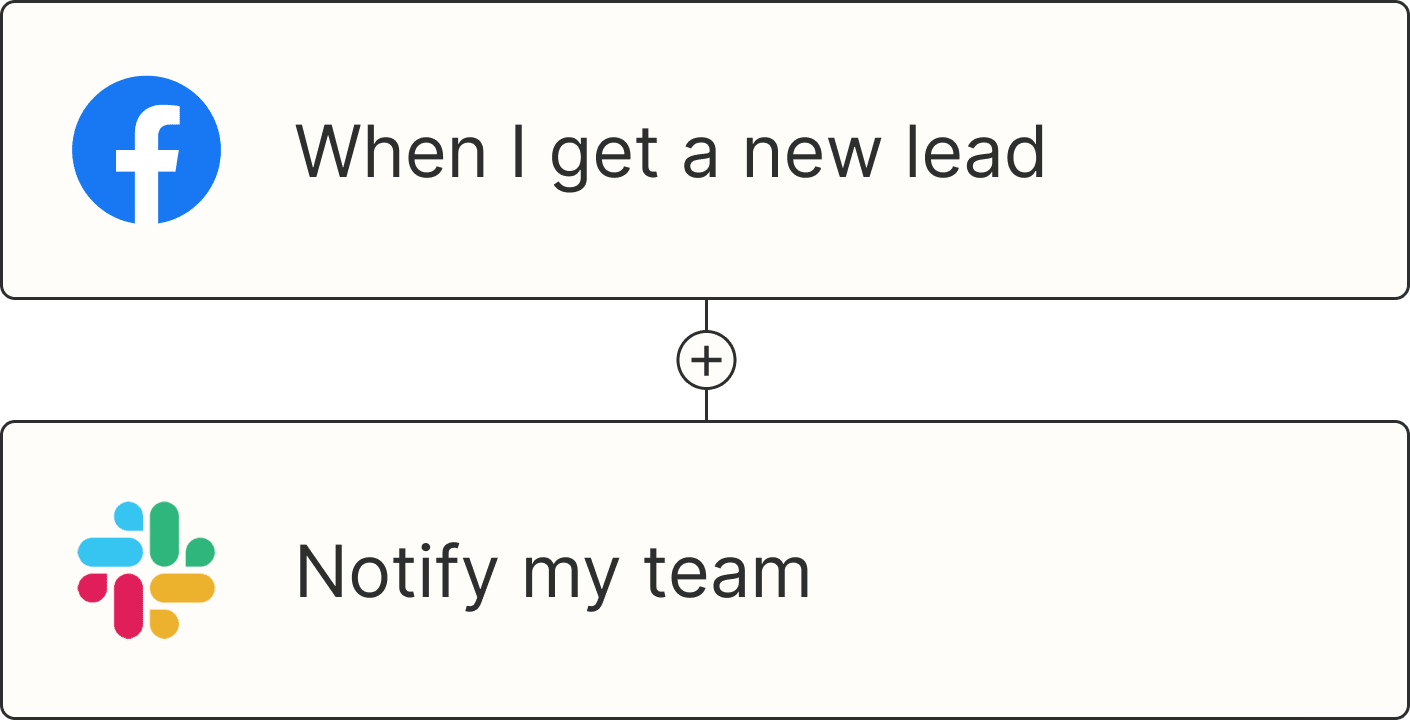
A Zap with the trigger 'When I get a new lead from Facebook,' and the action 'Notify my team in Slack'