• Home

  • App picks

  • App comparisons

App comparisons

12 min read

ClickUp vs. monday: Which project management tool is best? [2025]

By Allisa Boulette · October 4, 2024

Hero image with the logos of ClickUp and monday.com

When I got engaged, the instant barrage of super specific questions from loved ones about all things wedding threw me for a loop. What I thought would be a leisurely stroll through Pinterest boards quickly transformed into a strategic mission of organizing, prioritizing, and decision-making.

Planning a wedding is like the boss level of project management. And like a wedding, adding a PM tool to your team is like slipping on that perfect pair of dancing shoes—it might take a while to break them in, but once you do, everything moves so much smoother.

Having managed multiple projects in an agency setting, I can attest to the indispensability of PM tools. And after personally testing each app firsthand to evaluate its features and usability, I can honestly say you can't go wrong with either ClickUp or monday.com, especially when it comes to project management. But here, I'll walk you through the differences, so you can pick the one that's best for your team.

Table of contents

  • ClickUp vs. monday.com at a glance

  • monday has a better user experience for large teams

  • Both are packed with automations

  • ClickUp has more collaboration features

  • monday.com is more stable

  • ClickUp delivers more bang for your buck

  • Both platforms embrace AI

  • Which should you choose?

  • ClickUp vs. monday FAQ

ClickUp vs. monday.com at a glance

Before we dive in: monday.com and ClickUp both offer a few more-than-just-project-management features. They both have CRM functionality, for example, and monday also offers dev management features. But here, I'm focusing on the PM side of things.

Even just in the project management arena, both ClickUp and monday.com have transcended the traditional label of "project management tools." Instead, they embrace fancy terms like "work OS" and "work management," underscoring their robust capabilities that go beyond the standard offerings of tools like Trello.

I got into the weeds, testing them both to see how they stack up. Here's the short version (keep reading for more about my experiences with each app):

  • ClickUp, with all its bells and whistles, is great if you have a million things to juggle and want the flexibility to tackle them however you please. But be warned—there's a helluva learning curve.

  • monday.com has a more aesthetically pleasing interface than ClickUp, making it a top choice for the type of people who buy yogurt based on its packaging. monday.com offers a user-friendly experience that comes with out-of-the-box functionality to guide newbies.

You can think of them as the Apple and Android of project management software, with monday.com offering a sleek, if not sterile, interface much like Apple iOS. Meanwhile, ClickUp, like Android, provides many customization options for those who want to tailor their experience.

ClickUp

monday.com

Free features

⭐⭐⭐⭐⭐ Unlimited users and tasks

⭐⭐ Up to 2 users and 200 items (tasks)

Ease of use

⭐⭐ Interface can be overwhelming and has a learning curve

⭐⭐⭐⭐⭐ Clean and intuitive interface

Integrations

⭐⭐⭐⭐ 1,000+ app integrations; integrates with Zapier

⭐⭐⭐⭐⭐ 200+ app integrations; integrates with Zapier

Automation

⭐⭐⭐⭐ Free plan includes 100 automations/month, but they're a little harder to use

⭐⭐⭐⭐ Standard plan starts at 250 automations/month, and they're really easy to use

Time tracking

⭐⭐⭐⭐ All paid plans include unlimited time tracking; free plan limited to 60 uses

⭐⭐⭐ Availability begins with Pro plan

AI

⭐⭐⭐⭐ Offers integrated AI assistant for $7/user/mo on any paid plan; free trial available

⭐⭐⭐ AI can be used for task automation and content generation; currently in beta testing and will gradually be released to Pro and Enterprise users

Storage

⭐⭐⭐⭐⭐ All paid plans offer unlimited storage; 100 MB cap with free plan

⭐⭐⭐ No storage offered with free plan; paid plans have storage limits

CRM

⭐⭐⭐ Several CRM templates available

⭐⭐⭐⭐ Offers a basic CRM template; standalone CRM product available starting at $15/user/mo

Analytics

⭐⭐⭐⭐ Easy-to-read dashboard insights and custom reports

⭐⭐⭐⭐ Easy-to-read dashboard insights and custom reports

Pricing

⭐⭐⭐⭐⭐ Generous free plan has everything teams need, plus three paid plans:

Unlimited: $10/user/month

Business: $19/user/month

Enterprise: Custom

⭐⭐⭐ Limited free plan for up to 2 users, plus 4 paid plans, each with minimum of 3 users:

Basic: $12/user/month

Standard: $14/user/month

Pro: $24/user/month

Enterprise: Custom

monday has a better user experience for large teams, while ClickUp works best for smaller tech-savvy teams

As someone raised by the internet, I can hit the ground running with most computer programs and at least pretend to know what I'm doing. But diving into ClickUp for the first time made me feel about as tech-savvy as your dad. The smorgasbord of features, while impressive, left me feeling like I was trying to drink from a fire hose. But once I got the hang of it, it was rather satisfying, like finally figuring out how to program a VCR. (Remember those?)

ClickUp's interface is a double-edged sword of power and complexity. The home screen is highly modular, allowing users to tailor their workspace by adding, removing, resizing, and rearranging various widgets like recent activity, agendas, and task lists. This flexibility is fantastic if you know exactly what you need, but it can be a challenge if you don't.

I imagine ClickUp could be counterintuitive for new users. You may find yourself spending more time organizing your workspace and setting up tasks than you do actually working, which defeats the purpose of a productivity app. But once you get the hang of ClickUp, making it your own is a breeze. This is why smaller tech-savvy teams often favor ClickUp—it lets them tweak things just the way they like.

Both platforms provide in-app guidance, onboarding videos, extensive knowledge bases, and self-guided training, but monday offers a more beginner-friendly setup experience.

Example screenshot of the writer's monday.com board

Its visually pleasing interface is clean and streamlined, with everything you need within reach, eliminating the need to sift through never-ending menus or settings. I found myself instinctively knowing what to do and where to find things.

Of course, project visualization isn't one-size-fits-all—there are many ways to keep tabs on the chaos and watch it shape up in real time. ClickUp provides a range of views, including lists, boards, calendars, Gantt charts, activity timelines, workload displays, spreadsheets, and mind maps.

Screenshot of the author's ClickUp's list platform

In contrast, monday.com offers activity logs, Kanban boards, timelines, calendars, maps, graphs, and chart views.

Screenshot of the author's monday.com project visualization

Depending on the specific requirements of a team or project, one platform might be more suitable than the other. For instance, teams that rely heavily on visual brainstorming might find ClickUp's mind maps particularly beneficial, whereas those that prioritize data visualization might lean toward monday.com's graph and chart views. One curious thing about ClickUp is that its Gantt view doesn't have the option to add a baseline to monitor your project's performance. monday, on the other hand, offers a great Gantt chart view.

Screenshot of the author's monday.com board's Gantt chart view

Both ClickUp and monday.com are packed with automations and integrations, including Zapier

It's no secret that automations and integrations help speed up your work so you can do more in less time, especially when you're syncing up with apps that are the backbone of many businesses, like help desk platforms and business intelligence software. Both ClickUp and monday.com excel at automation and integration.

ClickUp is generous with automations, offering 100 monthly automations on its free plan and unlimited automations for paying users. In contrast, monday.com gates automations until you upgrade to the Standard plan. Even then, you only have up to 250 actions per month.

Limits aside, automations in monday.com are fill-in-the-blank, making them almost foolproof. monday offers a user-friendly, text-based approach to crafting automations. While there might be a slight learning curve if you're a complete automation newbie, once you get the hang of it, it's basically like filling out a Mad Lib to get your workflow on autopilot.

Screenshot of the author show casing ClickUp's automation functionalities

In comparison, I found ClickUp's automations to be more intimidating. I imagine you'd have to be able to wrap your head around conditions, triggers, and actions before effectively navigating ClickUp's automations feature. But once that light bulb goes off, it's pretty straightforward and user-friendly. After spending some quality time with it, I was quickly able to create automations to move tasks between lists depending on their status and to send alerts when a project due date approaches.

Screenshot of ClickUp's custom automation functionality

Overall, monday.com presents a sleeker interface that's especially accommodating for beginners, but both platforms offer easy, no-code automated workflows and tons of pre-built templates to get you started.

While ClickUp's 1,000+ integrations put monday.com's 200+ to shame, both platforms can expand their integration capabilities through Zapier, bridging any potential gaps. Learn more about how to connect ClickUp or monday.com to thousands of other apps, or get started with one of these pre-made workflows.

Create ClickUp tasks from Google Calendar events

Create ClickUp tasks from Google Calendar events
  • Google Calendar logo
  • ClickUp logo
Google Calendar + ClickUp

Add starred Gmail emails as tasks in ClickUp [Business Gmail Accounts Only]

Add starred Gmail emails as tasks in ClickUp [Business Gmail Accounts Only]
  • Gmail logo
  • ClickUp logo
Gmail + ClickUp

Create items on a monday.com board for new rows on Google Sheets

Create items on a monday.com board for new rows on Google Sheets
  • Google Sheets logo
  • monday.com logo
Google Sheets + monday.com

Add items in monday.com for new invitees created in Calendly

Add items in monday.com for new invitees created in Calendly
  • Calendly logo
  • monday.com logo
Calendly + monday.com

And if you're feeling fancy, both have open APIs for you to build your own integrations.

ClickUp has more collaboration features

Notifications

Like monday.com's omnipresent YouTube advertising campaign, ClickUp's notifications are relentless and out of control, and I was only collaborating with myself. After some detective work (and maybe a snack break), I found the notification settings, and the level of customization is wild. You can cherry-pick what pops up and when and where, so you only get pinged about the stuff you actually care about. Who knew being picky could be so satisfying?

Chat/email

When it comes to monday.com's collaboration tools, you'll find the essentials, like an interactive commenting system and a dedicated team update section. But monday.com leans heavily on external integrations for collaborative heavy lifting. Want a chat feature or email capabilities? You'll have to integrate with tools like Slack and Gmail.

ClickUp, on the other hand, has chat built in.

Screenshot of ClickUp's chat interface

Image annotation

ClickUp and monday both offer image annotation, allowing you to add and assign comments directly on task attachments such as design mockups and documents. This is especially clutch for people collaborating with visuals, like designers or cryptozoologists.

Both platforms do this similarly, but I give ClickUp the edge because you can pair annotated images with its generous storage space—a powerful combination. Teams can store and easily access detailed visuals, diagrams, or product designs, all annotated with real-time feedback.

Image annotation of the bestest boy in ClickUp

This means faster, clearer communication without the constant back and forth. It's like having a visual conversation archive, ensuring everyone is on the same page, reducing errors, and speeding up project timelines. It's the business version of "pics or it didn't happen."

Whiteboard

One notable ClickUp tool is Clip, which lets you create screen recordings directly within the platform and then easily share them with others. This seems perfect for quickly exchanging feedback on a particular topic or task. For me, Clip and other tools like its native Zoom integration and Mind Maps showcase ClickUp's commitment to being the "one app to replace them all."

Whiteboard view in ClickUp

I found that monday.com's reliance on external integrations makes the collaboration process more disruptive than ClickUp's. It also chose to remove its group whiteboard feature and launch a separate paid service called Work Canvas. This change might make some users think twice about its collaborative value, given they'd now have to shell out more money for something that used to be part of the package.

monday.com is more stable

I experienced a few hiccups while poking around ClickUp. Tasks often took several seconds to load, even when using my (neighbor's) fast internet connection. Just when I thought I was on a roll, ClickUp would sometimes refresh unexpectedly, causing my hard work to vanish. On a few occasions, items I had created disappeared immediately after creating them. These hiccups were frustrating and interrupted my workflow. It's anecdotal, yes, but in my research, I noticed that other ClickUp users have reported similar experiences.

ClickUp boasts about rolling out new features weekly, and while I'm all for a tool that keeps reinventing itself, it feels like they're maybe sacrificing a bit of stability in the process. Given the bugs I encountered, they should probably pump the brakes a bit ​​before adding the next shiny thing.

Meanwhile, monday.com's stability is notable. I've been cruising through it without a single glitch. While ClickUp's out here throwing new features at us like confetti, monday.com prioritizes a smooth user experience over rapid feature rollouts, ensuring that what's offered works seamlessly every time. monday.com may not have as many features as ClickUp, but the features it does have are well-developed and stable.

ClickUp delivers more bang for your buck

After comparing ClickUp and monday.com's plans, it's evident that ClickUp offers a richer feature set at its lower tiers. For example, ClickUp's Unlimited plan includes unlimited tasks, unlimited storage, unlimited dashboards, and unlimited custom fields.

To fully harness ClickUp's potential, that Unlimited plan is the sweet spot. It's ideal for teams of all sizes, but is especially well-suited for teams that need the most advanced features. Meanwhile, with monday.com, the full suite of essential features only unveils itself at the Pro level, which is the top tier before the Enterprise option.

Both platforms embrace AI, with ClickUp currently ahead in availability and integration

While both platforms offer innovative AI tools, ClickUp's is already fully integrated and available, while monday's is still in beta testing, available to select Pro and Enterprise users.

ClickUp's AI, known as ClickUp Brain, is available as an add-on for paid users at $7 per user per month. It's integrated throughout the platform, accessible via a dedicated AI button and contextual prompts in various areas like tasks and docs. It offers tailored AI assistance based on your specific role and use cases, making it easy to draft emails, summaries, or project updates. From there, users can fine-tune AI-generated content by adjusting tone and creativity levels.

In my experience, ClickUp Brain shows promise but is far from infallible. When I asked it to write a description of a task attachment—a very handsome photo of my very handsome dog—it confidently described it as a comprehensive project plan for an upcoming marketing campaign. Perhaps it's unfair to judge a project management AI on its image recognition skills, but it does highlight that there are still some kinks to iron out.

Screenshot of the ClickUp Brain interface

I didn't get a chance to take the monday.com AI Assistant for a spin myself due to its limited availability. From what I've seen, it promises similar task automation and content generation capabilities, like creating tasks from scratch or summarizing long threads. But it's still evolving, and monday.com is gradually releasing new features, like enhanced AI automations and a formula builder. If you're already on a Pro or Enterprise plan with monday.com, it might be worth signing up for the beta to see how it develops.

ClickUp vs. monday.com: Which should you choose?

If you need to coordinate training for a large team or simply don't want to invest copious amounts of time learning a new tool, ClickUp probably won't be agile enough for your workflow. However, I can see it being super useful for people who enjoy experimenting with new features and value flexibility over usability. ClickUp's standard plan is also more affordable than monday.com's standard plan, and it includes more features, such as advanced reporting and custom fields, offering a better value for teams on a budget.

If you prefer to jump into a tool without wading through extensive tutorials, monday.com might be more your speed. While ClickUp offers a plethora of features that cater to those who love tinkering and exploring, it might feel a touch overwhelming for those who prioritize ease of use. If you're after a more streamlined experience and have a larger team to manage, monday.com could be the better fit.

Choosing a project management app is like choosing a favorite pizza topping. It's entirely subjective and based on individual and team tastes, so there isn't a wrong answer (except olives).

ClickUp vs. monday FAQ

Before you venture into these ClickUp vs. monday.com frequently asked questions, just remember: it's not about answers—it's about discovering that the questions you never thought to ask are the ones that truly matter.

How is ClickUp different from monday.com?

While both ClickUp and monday.com are excellent project management platforms with similar features, they're suited to different preferences and requirements. ClickUp offers a wide range of features and customization options, while monday.com offers scalability and is visually appealing. Your choice depends on your specific needs and how you like to manage your projects and tasks.

What are the drawbacks of monday.com?

monday.com has a somewhat complex pricing structure and limited advanced features, which can pose challenges for budget-conscious users and those with specific customization needs.

Can I import data from ClickUp to monday?

Yes, you can import data from ClickUp to monday.com. There are a couple methods that you can use for this process:

  • You can export your data from ClickUp as an Excel/CSV file and then import it into monday.com using the import from Excel feature.

  • Zapier allows you to automate the process of importing data between ClickUp and monday.com. This can include actions such as creating new lists in ClickUp for new items in monday.com or vice versa.

  • If you're comfortable with APIs, you can use ClickUp's API to extract data and then use monday.com's API to import it. This method offers the most flexibility but requires technical expertise.

Is ClickUp or monday.com more suitable for Agile project management?

ClickUp is better for Agile project management than monday.com. ClickUp offers features explicitly designed for Agile project management, such as Scrum and Kanban boards, sprint dashboards, and agile reporting, which are essential tools for teams following the Agile methodology.

Related reading:

  • How to automate ClickUp with Zapier

  • How to choose project management software in 6 steps

  • Switching apps isn't scary

  • Trello vs: monday.com: Which should you use?

This article was originally published in October 2023. The most recent update was in October 2024.

Get productivity tips delivered straight to your inbox

We’ll email you 1-3 times per week—and never share your information.

tags
mentioned apps

Related articles

Improve your productivity automatically. Use Zapier to get your apps working together.
Sign up
See how Zapier works
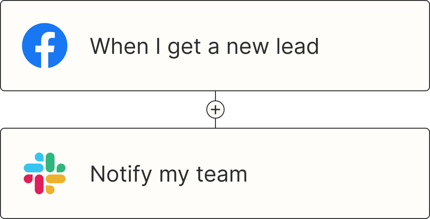
A Zap with the trigger 'When I get a new lead from Facebook,' and the action 'Notify my team in Slack'