Flawed data can guide even the greatest leaders to the wrong conclusions. When success hangs in the balance, you need to be absolutely sure that you're gathering the right data with the right methods. So we asked our data scientist, Christopher Peters, to craft this guide about how to collect and analyze data. It's like a college-level course in survey design: you'll learn how to write questions, distribute them, and synthesize the responses.
Surveys can make a major impact on the direction of your company—especially if you get the results in front of decision-makers.
Whether that impact is positive or negative depends on the quality of your survey. Sound survey design and analysis can illuminate new opportunities; faulty design leaves your team swinging in the dark.
As Zapier's data scientist, I lead testing and analysis for everything related to our app automation tool. I've used surveys to dissect how many seconds each Zapier Task saves someone (it's close to 180 seconds), and why people upgrade to a paid Zapier plan.
I've seen how data can be used as an instrument to help teams make smart choices. In this chapter, I'll teach you more than a dozen techniques that I use build an effective survey the first time.
Before We Start
It's important to note that there's a great deal of controversy among social scientists about survey design, with conflicting suggestions about methods. Statistics like "margin of error" are still widely used, but they're rarely appropriate for online surveys—The Huffington Post's senior data scientist and senior polling editor, for example, consider them an "ethical lapse". Conventional wisdom about what matters is not always grounded in statistical science. To cope with this, this chapter sticks to simple tried-and-true methods. I hope you'll find them useful.
1. How to Design a Survey
Before creating a survey, it's important to think about its purpose. Common purposes include:
Compiling market research
Soliciting feedback
Monitoring performance
Write down specific knowledge you'd like to gain from your survey, along with a couple of simple questions you think might answer your hypotheses (including the set of possible answers).
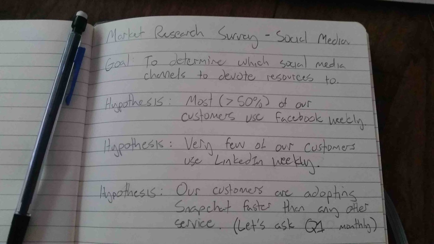
Next to the answers, write down the percentage of responses you'd expect in each bucket—comparing the future results against these guesses will reveal where your intuition is strong and where blind-spots exist.
|||{% include "blocks/image.html" with url="https://cdn.zapier.com/storage/photos/4f6a8c124e425b15ece50838ce737b40.jpg" caption="" link="" classes="center" alt="survey exercise 2" %}
On a scale of 1-100 rate the following statement(s):
Zapier and its blog posts help me do my job.
You would be forced to give a single answer reflecting feelings about both Zapier and its blog. This is sometimes called a "double-barrel question," and it can cause respondents to choose the subject they feel most strongly about. These cases can lead you to falsely interpret the results. It may also be possible that respondents have opposing views about both subjects. In that case, you're sure to collect misleading results.
Split the questions like these into multiple questions. Remember: Keep your questions as short and direct as possible.
Use Simple Language
Cleverness, humor, and business jargon can confuse respondents, especially if it causes them to misinterpret the question you're asking. Intentionally or not, we tend to write questions using ourselves and our cultural experiences as a reference, which can lead to poorly phrased copy that could confuse people. Using simple language can reduce the risk that the data you collect does not reflect the respondent's meaning.
Randomize Answers
Suppose you want to ask which of three products your users value the most (after making sure to include NA and "none"!). It's common for respondents to select the first answer simply because it's the easiest and most available. Randomization for categorical-type answers can help you avoid this bias.
Beware, though: if your question asks for an ordered answer (e.g. from Strongly disagree to Strongly agree), you should keep the order of the answers consistent throughout the survey to avoid confusion.
4. How to Select Survey Respondents
Most surveys are sent to a small subset of a larger population. Using such samples to make general statements about the population is called inference. Descriptive statistics are statements about just the sample; inferential statistics are statements about a population using a sample.
It's worth noting that inferential statistics with surveys is difficult and commonly impossible, even for experts. Sometimes you just can't generalize the sample to the population in a reliable way—you're stuck making statements about people who actually filled out the survey.
Most of the time, you can chalk this up to sampling bias: when your sample is not reflective of the population that you're interested in. Avoiding sampling bias is particularly important if you intend to analyze the results by segment.
One of the most famous examples of this problem occurred in the U.S. presidential election of 1948.

Retail businesses did poorly the first half of 2014. Successful applicants for credit were also much more likely to be profitable. Also, the larger the business the more likely it was profitable. This could be due to survivorship bias. That is, as insofar as a business is profitable does it become large. It could be that smaller businesses are more willing to operate at a loss. Or, it could be that larger U.S. businesses recovered faster from the financial crisis that began in late 2007.
If you find this graph style useful I've made a template that you can use. For more info on this graphical style, be sure to check out Naomi B. Robbins and Richard. M. Heiberger's article "Plotting Likert and Other Rating Scales."
Interval Data
A useful and safe way to summarize interval data is as if they are ordinal data.
Summarizing interval data with averages and standard deviations (see the "ratio data" section below for a guide) is possible, but only if the distance between intervals is even. For example, questions like "on a scale of 1-10" with answers of 1, 2, …. 9, 10. are generally considered even intervals. However, there is some controversy to this.
People tend to avoid extremes, so it might not be accurate to say that the interval of 5-6 is 11 times an answer of 0-1. Think of measures of pain, for example: is the distance from 5-6 the same as 0-1 or 9-10? I bet not.
My suggestion is to treat interval data as ordinal data if the intervals are even, otherwise treat it as nominal data and use a contingency table for summary.
Below is an example of the way that uneven interval data can misrepresent data. This example comes directly from someone I consider a great visualizer of information: Stephen Few. I highly recommend Stephen's site on visualization, especially with his article about selecting the right graph for your data.
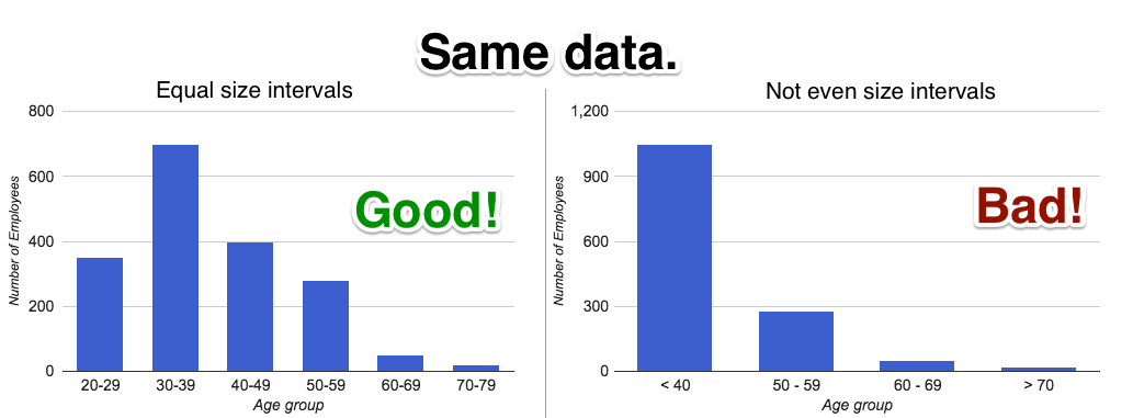
The visualization (called a diverging bar chart) makes it clear that small businesses turned very pessimistic about their financial situations beginning in the first quarter of 2009. It's also clear that optimism hasn't yet returned to the levels seen when the survey data begins in 2004.
Conclusion
Surveys and polls are a very effective tool for gathering feedback from customers and reducing the uncertainty around important decisions. By writing down the purpose of your survey and hypotheses up front, you'll be able to learn where your intuition is strong and find organizational blind spots.
Surveying is hard and biases can enter through poor survey delivery and poor question design. It's important to think about which data type will be most useful to answer the questions at hand. Focused surveys are the most likely to yield actionable results.
Rather than sending out one massive survey, iterate on a set of survey instruments sampling a bit of the population as you go. The process is as much about finding the right questions as it is about finding their respective answers.
Once you feel confident with your design, send out one large final survey. Keep in mind that the best designed survey in the world is useless if its results are not communicated effectively to stakeholders. Don't abuse categorical or ordinal data by taking averages, summarize by relative frequencies. Don't bombard readers with huge tables that are impossible to digest—take a bit of time and create a diverging bar chart. If you use interval data, keep in mind its utility for segmentation and don't fool readers by visualizing uneven intervals.
Finally, surveys are no place to get fancy. Keep it simple and you'll find that no matter the results you'll learn something of use!
Image Credits: Election photo courtesy Library of Congress.
