• Home

  • Business growth

  • Business tips

Business tips

6 min read

How to get people to take a survey

An Amazon gift card isn't the solution.

By Katie Paterson · March 9, 2022
Hero image with an icon of a survey

For some reason, customers are never as excited about filling out a survey as we think they should be. And there's nothing worse than expecting an influx of responses only to get…crickets.

But don't throw in the towel just yet. I've created loads of surveys in my time as a marketer, and I've learned a few tricks along the way that can help increase your survey response rate. These tips will encourage more people to take your surveys and ensure that those who start your surveys always finish them. 

You'll notice I use Typeform as an example a lot here—that's because it has some features I find particularly helpful in achieving my survey goals. But most of these tips can be applied to whatever form or survey app you use.

  1. Offer a targeted incentive

  2. Create an irresistible welcome screen

  3. Embed, don't redirect

  4. Tell them how long it will take

  5. Create a personalized survey journey

  6. Make the survey itself interesting

1. Offer a targeted incentive 

Rewards are always going to be the most effective way of convincing someone to take your survey. We all naturally expect a little something in return for our time, right? 

But rather than go down the popular route of dishing out Amazon gift cards to your respondents, be strategic with what you offer. Choose a reward that appeals strongly to your target market—otherwise, you'll end up with lots of survey satisficers and even professional survey-takers (yup, it's a thing) who aren't actually relevant and rush through the survey just to get the compensation. And that just leads to unusable survey data. 

For example, if you're looking to gather more responses from dog owners, you could offer vouchers for dog food; or if your respondents are your own customers, you could offer a discount or early access to a new feature. 

Rewards don't always have to be monetary, and the more relevant you make them to your target market, the more likely you'll incentivize the right people. 

2. Create an irresistible welcome screen

As any good salesperson will tell you, everything relies on that killer opening line. When you're creating a survey, your welcome screen is your opening line in survey form. How can you instantly engage someone so they can't resist taking your survey? 

The key is to ask a question where you know the answer is very likely to be "yes." You could go down the route of describing a pain point you know they have, or you could tempt them with your incentive.

Sticking with our dog food reward, here's an example welcome screen I put together in Typeform for a fake pet shop looking for responses from dog owners.  

Welcome screen example (with a pug face, asking dog owners "Do you want free dog food for a year?")

This includes most of what you'd want on your welcome screen to maximize responses: 

  • Opening line. I've gone for the incentive here. What dog owner wouldn't want free dog food for a whole year?

  • Your company logo. This provides trust and credibility and reminds people who you are.

  • Powerful imagery. Typeform has a whole gallery of free images that will make your surveys pop. Who's going to say no to that face?

  • A description of what the survey is about. Be transparent about what you're looking for (in this case, product feedback).

  • Time to complete. I have five minutes to spare, so why not?

  • Clarification of anonymity. If the survey will be anonymous, add this somewhere on your welcome screen too. It might boost your chances for anyone who's skeptical about data collection.

Here's a non-invented example for you: Big Cartel's welcome screen on their customer feedback survey.

BigCartel survey welcome screen

It's not flashy, but it works well because it speaks really specifically to a pain point existing customers are feeling. The incentive is that filling out the survey might improve the product and make their lives easier—no monetary reward needed.

3. Embed, don't redirect 

One click might feel like small potatoes, but it could have a huge impact on your survey response rates: surveys embedded on your webpage or in your email can get 135% more responses than those that link out to another site.

It makes sense. You need your welcome screen to work its magic in enticing people to take your survey, and when you embed it, the welcome screen is permanently on show. There's only so much convincing a single CTA button or hyperlink can do.

Plus, redirecting people to a new webpage can be off-putting. It interrupts their flow, they don't 100% know how trustworthy the link is, and if it takes more than a second or two to load, people will click away without a second thought.

Embedding your survey keeps everything quick, simple, and straightforward. Most good form apps will give you an embed code for sharing directly on your site, and lots of them integrate with email marketing tools, so you can embed your survey straight into your marketing emails.

4. Tell them how long it will take 

If you give a clear indication of how long it will take to complete your survey, you're likely to get more respondents. It'll also help you ensure your survey isn't going off the rails. Less than seven minutes is ideal, so be concise and use as few questions as possible.

Most form apps have a feature that automatically generates an estimate of how long the survey will take to complete based on the number and type of questions. If you ask a lot of open-ended questions (where respondents need to type out answers) instead of close-ended questions (where they just select an answer from a multiple-choice list), this will increase the predicted time-to-complete substantially. Of course, open-ended questions are sometimes the most valuable—but you'll need to find the right balance.

And it's not just about telling people the length of the survey on the welcome screen. You'll get fewer drop-offs if people know how far along they are, so be sure to enable the progress bar feature.

Progress bar feature in Typeform

5. Create a personalized survey journey  

If your target market has a range of different personas, create a unique survey journey for each one. You don't need to create separate surveys—most form and survey apps have logic features that allow you to take respondents down a totally different path and show them a different set of questions depending on their answer to a persona-related question at the start. The first time I used this feature for a Typeform survey, it blew my mind and made the rest of the survey so much more effective.

Another great feature of many survey apps is that you can repeat the respondent's personal information throughout the survey (in Typeform, it's called Recall information). For example, if they fill in their name at the start, you can repeat it in a way that makes it really conversational and keeps people engaged until the end.

Katie's name popping up in a survey

Typeform and some other survey apps can also integrate with your CRM to pre-populate the survey with a respondent's personal data before they've even taken the survey. Sounds creepy, but it's not: Typeform just pulls the information directly from the contact's record and displays it in the survey using its hidden fields feature

This means you can send people emails with an embedded survey that already has the respondent's name on the survey welcome screen. It doesn't get more personalized than that.

6. Keep your survey interesting 

Most surveys are boring. So if you can make yours not boring, it'll stand out and increase your completion rates.

This is where I think Typeform really takes the cake—its strong focus on design means you can customize your surveys to make them look a bit more fun than they probably are. 

But it's not just about design. You should also try to use a variety of question formats to mix things up and keep your respondents engaged and interested. For example, rather than multiple choice across the board, try adding a rating question, a Likert scale, an opinion scale, or a matrix. Even just adding pictures to your multiple choice questions like this company did can make a big difference.

Adding images to a survey question

You'd be surprised how much of an effect small changes like these can have on your survey response rates. 


Whatever form tool you're using, take time to review all the features you have access to: you could be underutilizing some options that are designed to bring in more respondents. In my experience, the more personalized you can get with your survey, the better. Do a little trial and error until you find out what works.

Get productivity tips delivered straight to your inbox

We’ll email you 1-3 times per week—and never share your information.

tags
mentioned apps

Related articles

Improve your productivity automatically. Use Zapier to get your apps working together.
Sign up
See how Zapier works
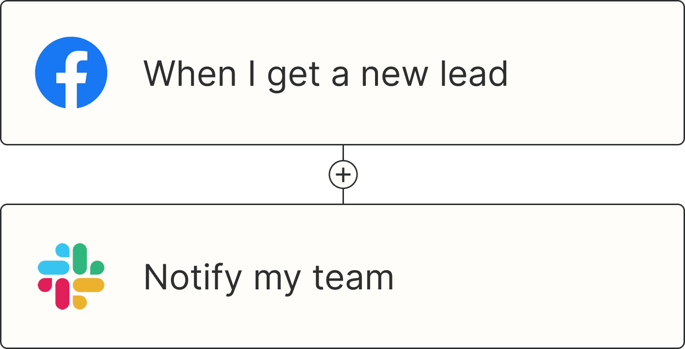
A Zap with the trigger 'When I get a new lead from Facebook,' and the action 'Notify my team in Slack'