• Home

  • Business growth

  • Marketing tips

Marketing tips

14 min read

20 landing page examples to help you increase conversions

By Katie Paterson · June 4, 2024
Hero image with an icon of a landing page or website

Any time I publish a landing page, I'm immediately thinking about what I could do next to make it better. How can I optimize the page to pull in more visitors? What new things can I add to see if we can improve conversions?

Managing a successful landing page involves constantly testing new ideas, keeping an eye on the data, and adapting to whatever seems to resonate with your target audience. It's the beauty (or the drag, depending on how you look at it!) of online marketing.

To inspire your next campaign, I've collected 20 of the best landing page examples from a range of industries: SaaS, health and wellness, eCommerce, marketing, and more. Ahead, I'll tell you what they do right and give you tips on how to boost conversions with your own landing pages.

20 landing page examples for your next campaign

The pages below have more than a well-placed CTA. Take a look, and see which elements from these landing page examples might translate well for your own purposes. (Note: some of these examples come from home pages, but the tactics will work just as well for your landing pages.)

Table of contents:

  • Revolution Studio

  • HubSpot Website Grader

  • HelloFresh

  • BorrowMyDoggy

  • Zapier

  • Airbnb

  • Suno

  • Notion

  • WordPress

  • Cocokind

  • NordVPN

  • Audible

  • LinkedIn

  • Olly

  • Ahrefs

  • Chobani

  • GetYourGuide

  • Figma

  • ChatGPT

  • One More Day on the Appalachian Trail

1. Revolution Studio

Why it works: Wows with video

Revolution Studios home page showing a cycle studio with unique lighting on the wall

As a writer, this is something that's tough to admit: sometimes, copy just isn't enough. I've grown to accept that using video on landing pages can really fill gaps, helping you communicate messages and ideas where copy, images, or illustrations fall short. 

Check out the above example from Revolution Studio, which is the spin studio I actually go to. I signed up for a membership without even visiting the place because the video did so much to convince me that it was exactly the kind of workout I was looking for. No powerful adjectives would've had the same effect.

There are a few different ways you could go about adding video to your landing pages: 

  • You could embed a product or how-to video to show your product in action and bring a few use cases to life.

  • You could use a testimonial video to add some social proof. 

  • You could even turn the entire background of your landing page into a video. With health and fitness businesses, for example, communicating the right energy and atmosphere is key to pushing visitors over that line, and in-your-face video is the perfect way to do it.

2. HubSpot website grader

Why it works: Offers something for free

HubSpot Website Grader with sections to fill in your website and email

Sometimes, a free trial of a product or service isn't enough to push prospects to hit that CTA. If you expect a fair bit of commitment from your customers (a substantial monthly fee or annual contract, for example), you might need to go a step further. Give them something for free—and do it on your landing page.

A great example is HubSpot's website grader. Enter your website URL (and your email address, of course), and it will give you an overall score and highlight any potential areas of your website that aren't performing well. "Oh, and did we mention we offer websites as part of your HubSpot package?" It's the perfect foot-in-the-door technique.

If you're a B2C business selling a tangible product, some sort of free sample will go down a treat. If you're selling a B2B SaaS product, think about offering something that you know will be of value to your target market, like an eBook or an insights report—any sort of lead magnet is a great start to the inbound journey.

You can use Zapier's pre-built free offer template to collect customer information through a highly customizable form. After someone submits the form, they'll immediately receive an automated email with your free offer. All this is happening while your leads' data is neatly organized in a connected table.

3. HelloFresh

Why it works: Links to your app (with a QR code)

A HelloFresh landing page with a QR code

A friend recently talked me into joining the meal-kit company HelloFresh. (She got a free meal box out of it, of course!) Scanning through the landing page, I was pretty convinced, but what made me want to act immediately was the QR code that took me straight to the app. There, I could choose my menu and see the different options available for my area, so it felt personalized (and even more convincing).

Capturing leads is one thing, but what if you need visitors to download an iOS or Android app to fully sign up? The more you can connect these two outcomes, the better. Including Apple and Google Play store buttons on your landing page works, but adding a QR code that takes visitors straight to the app download is way more streamlined (and a bit more fun).

Sure, QR code technology is nothing new, but there's still something kind of novel about it, right? Linking the landing page up to the app also meant I was able to easily sign up using Apple Pay in a couple of phone clicks instead of manually entering my card details—which makes me much more likely to convert.

4. BorrowMyDoggy

Why it works: Showcases social proof

Borrow My Doggy social proof

We all know social proof works. Studies have shown it, and the fact that you've probably never bought anything without reading a review first shows it. So it's no surprise that adding social proof to landing pages can do a good job at increasing conversions.

The example above from dog-walking marketplace BorrowMyDoggy shows how convincing this technique can be. Here, you have pictures of real customers along with reviews that address the most common buyer questions and objections. This kind of social proof does all the selling for you.

Social proof can come in all sorts of ways: reviews, testimonials, quotes, photos—the list goes on. If other people like what you're trying to sell, a landing page is the right place to show that off.

5. Zapier

Why it works: Integrates a social media feed

A twitter feed on Zapier

Social feeds work so well that lots of brands actually put them on their home page. Here's how Zapier does it.

If your customers are so engaged with your brand that they actually take the time to post about you on social media, you know you're doing something right—and integrating a social media feed on your landing pages is social proof gold. It's raw, unfiltered community showcasing that screams, "you're going to love this brand as much as we do."

6. Airbnb

Why it works: Personalizes with geolocation

Airbnb geolocation landing page

Here's a great example of a personalized landing page from Airbnb. They use geolocation data to automatically generate potential earnings for you based on the last 12 months of booking data for similar listings in your area. You can use the sliding scale to see how much you'd earn from one night up to 30 nights if you were to rent your property through the service.

I'd never even considered renting my apartment through Airbnb; I was only on the site to book accommodation for a trip to Prague. Now, all of a sudden, I'm seriously considering becoming a host and moving in with my parents to make some cash. See if your landing page builder offers geolocation options, and you might be able to create something that has the same impact.

Related reading: How to target thousands of locations with one ad campaign and one landing page 

7. Suno

Why it works: Provides a "here's one I made earlier"

The Suno landing page letting you choose what kind of song to make

Suno is an AI tool that auto-generates songs for you based on a simple description like "make a heartfelt song about my postman, Henry." They built a neat introductory landing page where you can scroll through sample descriptions and click to hear the songs the tool has generated. 

After listening to the demos, the simple "Make a song" button is so tempting. How could I resist signing up so I can make a song about my favorite cat, Zsa Zsa, who snores like a human and does tricks like a dog? (Yes, he's real!)

If, like me, you grew up watching Blue Peter in the '90s, the line "here's one I made earlier" will strike a chord. Even if you didn't, I'm sure you get the idea. This tactic won't work for every landing page, as it relies on your product or service being something you can easily access online. But if you're able to provide a tangible demonstration of what you're offering in action, this is going to be really convincing on a landing page. 

8. Notion

Why it works: Includes a secondary CTA

Notion's two CTAs: Sign up free and Request a demo

We all know the rules when it comes to adding CTAs to landing pages: use one, keep the copy short, and make sure it encourages quick action. But sometimes, a prospect will hit your landing page, and they're not quite ready to "sign up" or "join now." Why should you lose that prospect completely just because they're not sales-ready?

I've noticed a lot of big brands breaking the CTA rules in a way that totally makes sense. They're adding secondary CTAs to landing pages to capture those colder leads, so they can warm them up later.

Take the above example from Notion. While both CTA options involve seeing the software in action, Notion has likely learned that not everyone is ready to instantly start using the software—even if they can use it for free. Getting the most out of a platform like Notion can involve a bit of an initial learning curve, so some prospects will prefer to have a demo before feeling their way around themselves.  

The colors of the buttons ensure that the secondary CTA doesn't overshadow the primary one (they would rather people try the tool themselves because demos cost resources), but adding that extra option to the page will undoubtedly improve conversions.

This is why it's so important to consistently A/B test your landing pages with different CTA options to see what resonates with your audience. You might find that breaking the rules is exactly what your website visitors want.

9. WordPress

Why it works: Showcases visual examples

WordPress Home Page with the words "WordPress, Your Way" written in large white text

What better way to advertise WordPress than to show off what others have made using WordPress? While you can't see them in a static screenshot, this landing page has three revolving carousels of design themes, curated to demonstrate the breadth and depth of WordPress's CMS.

As an amateur web designer, nothing draws me to a site builder quite like beautiful themes. I want to know what my website could look like before I put in the hours to create it. WordPress's landing page gives me as many visual examples as I could ask for, which is important for something as variable as web design.

Even better, each of these themes will freeze and display a CTA when you hover over one with your mouse. And in this case, the more opportunities to convert, the better.

10. Cocokind

Why it works: Engages with a quiz

Cocokind home page offering the user a skin care routine quiz

Online quizzes are an internet treasure. You can take them to find out just about anything: which animal kingdom you belong to, which fruit or vegetable you most closely resemble, and what your favorite ice cream flavor should be based on your zodiac sign. 

Beauty, wellness, and other brands use online quizzes to give personalized product recommendations to customers. They make for a more engaging shopping experience than the basic "search, browse, add to cart" routine (while still creating opportunities to convert). Check out the above landing page from Cocokind for a solid example.

As far as CTAs go, I find quizzes to be especially enticing—I know a product page is coming eventually, but I can have a bit of fun before I get there. 

11. NordVPN

Why it works: Features a flash sale

NordVPN home page showing a women being protected by a screen

This landing page from NordVPN drives conversions with a flash sale. The key details here are the percentage you'll save, the bonus three-month offer, and the time remaining to get the deal. 

74% off sounds tempting on its own, but sweetening the deal with extra subscription months is what turns this from a good bargain into a great one. At the same time, the countdown clock instills a sense of urgency. (Without a timer, it's not a flash sale.) If your brand has a big sale coming up, try including similar deal-sweetening elements in your landing page.

12. Audible

Why it works: Focuses on popular content

Landing page for Audible showing famous book covers from Brittany Spears, Elon Musk and Matthew McConaughey

The content-first approach to landing pages is a favorite of streaming platforms, and Audible is no exception. When you're asking someone to sign up for a monthly subscription, it's important to show that your platform has enough content—and enough good content—to keep them interested for longer than a few days.

Here, Audible frames their CTA with popular content—celebrity audiobooks, in this case. This lets me know what some of their hottest offerings are (and if I scroll down, it shows me even more). If even one book catches my eye, I'm much more likely to click that free trial button.

13. LinkedIn

Why it works: Highlights AI features

LinkedIn Premium Landing Page

AI has been a hot topic for quite some time now, and more businesses than ever have added AI tools to their websites and software. LinkedIn is no exception, and they've made this abundantly clear on their landing page for LinkedIn Premium.

They're so convinced of the power of AI that they don't even talk about Premium itself until you scroll down the page. Up front, it's all about how AI powers the Premium experience, and to the right, there's a graphic that shows an AI profile enhancement tool in action.

Artificial intelligence has enough buzz that LinkedIn knows they can lead with it. If your business has AI features to offer, you might boost conversions by putting them front and center.

14. Olly

Why it works: Leads with new products 

Colorful orange landing page showing Olly vitamin products

You don't need to be Don Draper to recognize the power of "what's new" in product marketing. Simply by being different from what's old, newness attracts. Olly puts this principle into practice on their landing page, which hits you with their latest supplements as soon as you click onto the site.

Even if I want to shop for something else, the new gummies are there—like jewelry behind glass—to stir up interest. I don't know about you, but I'm always willing to investigate a product debut. How else am I going to learn what's new about it?

15. Ahrefs

Why it works: Prioritizes readability

Bright blue Ahrefs landing page with large white letters and a star

It's hard to grasp just how important readability is until you see a website that gets it oh so wrong. As soon as I have to zoom in or go hunting for my glasses, you've lost me. And when it comes to landing pages, losing people means losing potential conversions.

Unclear fonts, jarring colors, and an overcrowded UI will scare off site visitors—which is why good landing pages have readable fonts, complementary colors, and clean designs. 

Take a look at this example from Ahrefs. The main copy is very easy to read: the orange CTA button stands out boldly against the blue background, and playful icons break up the text. There's beauty in simplicity, and it doesn't get much simpler (or more readable) than this. 

16. Chobani

Why it works: Cycles between CTAs

Colorful yellow kitchen backsplash with chobani coffee creamers in front of a vase and flowers in front

In this example, Chobani takes a "more is more" approach to the art of the landing page. Why offer one CTA when you could offer five? While this won't work for every business, Chobani sells a wide enough range of products that cycling between several distinct CTAs on the same page makes sense.

Each entry in the slideshow links to a different product line (and, in one instance, a news post). This is a good way to show off your brand's variety or appeal to different audiences with just one landing page. 

Not every user will stick around to see all five cards, but people like me definitely will. (I always have to know what comes next in a slideshow.) 

17. GetYourGuide

Why it works: Focuses on an experience

GetYourGuide landing page showing a group of travelers making pasta

As a travel platform, GetYourGuide is in the business of making memories. Because there are too many travel destinations to list on one landing page, GetYourGuide makes the smart choice of narrowing in on a highly specific experience: attending a pasta-making class in Rome. 

This tells me exactly what kind of memory I could make if I use GetYourGuide to book activities for a trip to Rome. As someone who plans a full itinerary for even the simplest day trips, the specificity is a huge plus. 

What's also great about this example are the separate tabs for Culture, Nature, Food, and Sports, each with its own relevant experience and CTA. That's four opportunities to convert different types of travelers—history lovers, hikers, foodies, and daredevils—all in one convenient place. 

18. Figma

Why it works: Attracts with smart copy

Homepage of the Figjam landing pages showing the design strength and collaboration of the tool

Don't underestimate the impact of a good slogan. Just take a look at Figma's FigJam landing page. It's super readable, the color palette is easy on the eyes, and there's one CTA offering a free trial. Great, right? 

But the slogan—"Turn possibilities into plans"—is what really takes this landing page to the next level. Figma seems to agree, since they've made it the most prominent element in the design. (Just look at that font size!) While the blurb beneath the slogan has more information, it doesn't grab you like the catchy tagline does.

Slogans have always played a key role in advertising, but they're sometimes overlooked in landing pages. My advice: if you've got a good one, let it shine. If you're still in the drafting phase, check out these tips for writing strong copy.

19. ChatGPT

Why it works: Highlights functionality

Black screen with white font displaying the ChatGPT landing page

While several examples on this list are quite design-heavy, OpenAI strips everything back for their ChatGPT landing page. You won't find any fun icons or vibrant colors here—just white text on a black background and a single CTA button.

So why does it work? Well, in a handful of snappy sentences, OpenAI comes right out and tells me what I can do with their chatbot. There are big-picture use cases like "finding inspiration" and "increasing productivity," but also specific actions: writing, learning, and brainstorming. I'm never in doubt about what ChatGPT does, and that's important.

ChatGPT, like all AI chatbots, relies on human interaction—the more you put in, the more it puts out. Giving prospective users a shortlist of key functions is a smart way to kick-start that interaction (and convert in the process).

20. One More Day on the Appalachian Trail

Why it works: Automates with Zapier Interfaces

 One More Day on the Appalachian Trail Landing page that used Interfaces

Some of the landing page examples mentioned in this article probably took a lot of time to create, and some you probably couldn't produce without the help of a developer. If you don't have the time, knowledge, or budget for that kind of work but you still need a landing page that converts, try Zapier Interfaces

With Interfaces, you can build powerful landing pages using an easy no-code drag-and-drop system (or use this landing page template to make it even easier). In the above example from One More Day on the Appalachian Trail, the site used Interfaces to add a fillable form with a CTA.

Any Interfaces landing page can also be hooked up to thousands of different apps, so you can send all the leads you capture directly where they need to be.

Try Zapier Interfaces

Automate your landing pages 

Whatever route you decide to take with your landing page, you'll want to automate as much of the output as you can. That way, you can leave the page to work its magic and focus on working the leads it's bringing in. 

Regardless of which tools you already use for lead generation, Zapier will hook them up seamlessly to your landing page. Zapier allows you to automate loads of different actions, like sending lead data straight to your CRM, or triggering a personalized email to go out when visitors hit the CTA button. Or maybe you want to get a Slack notification each time a new lead comes in, so you can reach out to the prospect directly while the fire is still hot. 

Learn more about how to automate your landing pages, or get started with one of these pre-made workflows.

Send emails when there are new Unbounce form submissions

Send emails when there are new Unbounce form submissions
  • Unbounce logo
  • Email by Zapier logo
Unbounce + Email by Zapier

Add new Kickoff Labs signups to ActiveCampaign as new contacts

Add new Kickoff Labs signups to ActiveCampaign as new contacts
  • KickoffLabs logo
  • ActiveCampaign logo
KickoffLabs + ActiveCampaign

Update Salesforce leads from new Wishpond leads

Update Salesforce leads from new Wishpond leads
  • Wishpond logo
  • Salesforce logo
Wishpond + Salesforce

Zapier is the leader in workflow automation—integrating with thousands of apps from partners like Google, Salesforce, and Microsoft. Use interfaces, data tables, and logic to build secure, automated systems for your business-critical workflows across your organization's technology stack. Learn more.

Related reading:

  • What is a squeeze page?

  • ClickFunnels vs. Leadpages: Which should you choose?

  • The best lead generation software and tools

  • Why your landing page isn't working

This article was originally published in August 2022. The most recent update, with contributions from Dylan Reber, was in June 2024.

Get productivity tips delivered straight to your inbox

We’ll email you 1-3 times per week—and never share your information.

tags

Related articles

Improve your productivity automatically. Use Zapier to get your apps working together.
Sign up
See how Zapier works
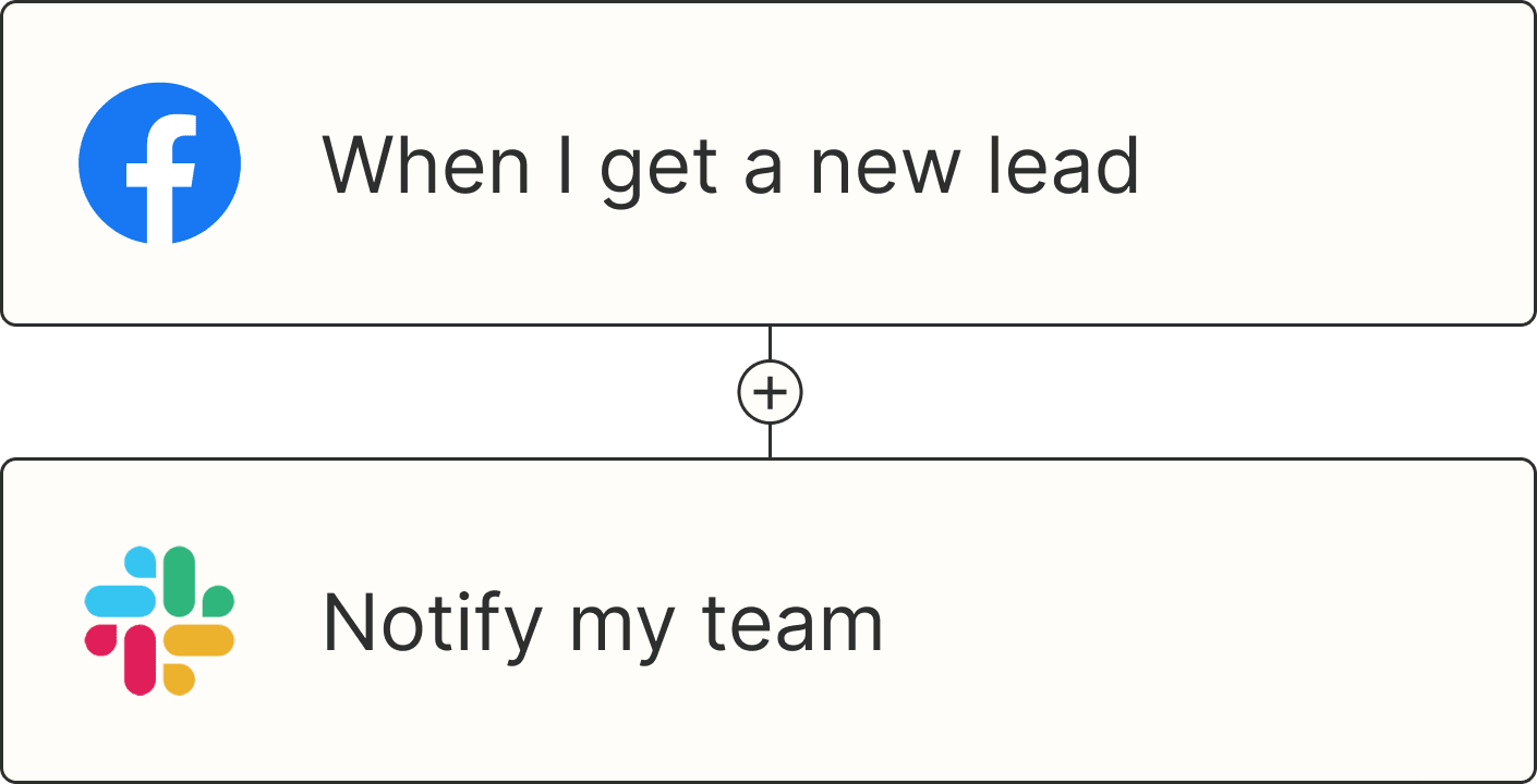
A Zap with the trigger 'When I get a new lead from Facebook,' and the action 'Notify my team in Slack'