• Home

  • Business growth

  • Marketing tips

Marketing tips

5 min read

Why your landing page isn't working (and how to fix it)

By Beatrice Manuel · May 18, 2022
Hero image with an icon of a landing page or website

When Tom called us, he was passionate about his field, educated in the issues his customers were facing, and determined to make his business work. But he was bleeding leads—and he didn't know why.

As soon as he showed us his landing page, the problem became clear. It was—and I mean this very literally—the worst landing page anyone at MediaBerry had ever seen. And we've seen a lot of landing pages. Our founder, Mark, became an accidental landing page expert back in 2018, and since then, we've been building them for ourselves and our clients. 

To stop you from falling into the same landing page disaster, I'm going to walk you through everything that was wrong with Tom's landing page—and show you how to fix it.

7 mistakes to avoid when creating a landing page

Yes, schadenfreude is real, and looking at a disaster of a landing page could be a good learning opportunity. But out of respect for Tom (that's not even his real name), we're not going to do that. Every marketer and business owner has produced sub-par marketing—I know I have—and having the entire world know about it isn't what we need.

Instead, I'll describe the issues I saw on Tom's landing page to help you identify issues with your own landing page—and ways you can fix them. 

  • Lack of social proof

  • Overwhelming visuals

  • Too much information

  • Not mobile-friendly

  • Lack of value

  • Slow loading times

  • Generic look and feel

1. The page had no social proof

Have you ever come close to buying something but backed out of the sale because the website seemed dodgy? Tom's website gave off that dodgy vibe. 

Sometimes it's hard to pinpoint why something feels sketchy, but there's one thing that will always set off alarm bells: a lack of social proof. When people come to your website and see that other people trust you, they're more likely to trust you themselves. Your social proof can come from a lot of different places: 

  • Customer reviews

  • Video testimonials

  • Certifications your business has 

  • Live sales figures 

  • User-generated content (UGC)

  • Links to your social media pages and content marketing 

  • Case studies and customer stories

  • Awards you've won

  • Ratings on trusted sites

  • Media placements

What you use will depend on what you have available and what you think will resonate most with your audience. In Tom's case, we started by adding an award his brand had won to the page to show that an external source had found his business to be reputable. Then we added his scores from Trustpilot, his BBB rating, and some testimonials from three loyal customers. Finally, Tom had local media coverage, so we added a clip of the segment to the page. 

2. The page was visually overwhelming 

When I visited Tom's page, my eyes went all over the place. It made me want to click that back button immediately.

The good news: the fix for a visually overwhelming website is easy. You don't need to eliminate all your images (and you shouldn't—visual content is important). Instead, you need to establish a clear visual hierarchy, so people's eyes are drawn toward the elements you want to prioritize. Use white space, size your images carefully, and be sure your fonts and color palette emphasize the right parts of the page.

You can see some of these elements at play on Fossil's home page below. 

Fossil's home page

Immediately, your eyes go to the image, the text in the center, and the call to action (CTA) prompting you to "shop the gift guide." You know where to look, and you know where to click. 

3. The page provided too much information

Tom was incredibly passionate about his field, and he translated that passion into his website using words. On his landing page, you were met with large blocks of text that explained the nuances of his company's engineering products in detail. 

It wasn't that it wasn't helpful—it was just too much. So we used the inverted pyramid approach to shorten his copy:

  • Start with a hook to draw people in—like a question, statistic, or clear benefit.

  • Then present the most important information (the who, what, where, when, why).

  • Finally, space out the rest of your content toward the bottom of the page in order or importance. 

The inverted pyramid approach keeps people scrolling. Then, once they're sufficiently informed, you hit them with another CTA.

4. The page didn't work on mobile devices

It's amazing that people still don't QA their websites on mobile. More than half your traffic probably comes from mobile, so it's worth even doing a mobile-first design. At the very least, you need to be sure your page works seamlessly on mobile.

Tom's page was wonky on mobile, and once again, the fix was easy: we switched him to a mobile-friendly theme, and we adjusted the buttons so they were easier to tap. Try those quick fixes on your site, and if you still don't see any change in metrics, dig deeper:

  • Remove excess images 

  • Add more space between links (so they're easy to click)

  • Remove anything requiring Flash

  • Remove pop-ups

  • Make your text larger 

  • Add a button so people can switch between mobile and desktop views

  • Use Accelerated Mobile Pages (AMP)

  • Remove autocorrect in forms 

5. The page wasn't giving back to the visitor

Tom's website was for Tom, not for his audience. That came through in the text bombs I mentioned earlier, but it also came through in the lack of value offered on the page. Visitors know when they aren't the priority, and they'll react accordingly. 

If you want people to engage, you need to offer them value. In Tom's case, we added a lead magnet (specifically, an eBook) and a discount code offering 10% off. But these aren't the only ways to add value. Depending on what you're selling, you might offer a free trial, free shipping, a webinar recording, or anything in between. Just be sure that whatever you're offering is valuable for your leads.

Cocokind does this in a variety of ways. They offer a pop-up discount for signing up for their newsletter, and they also link visitors to a quiz they can fill out for personalized product recommendations. That's just right for their audience who's looking for new products.

Cocokind quiz to find product recommendations

6. The page was too slow

Tom's website loaded in just over four seconds. That's not a lot in human time, but it's an eternity in website loading time. Google knows when sites are slow, and no one wants to wait for a page to load.

To speed up his website, Tom added a content delivery network (CDN), reduced the size of his images (his website was very image-heavy), and removed all redirects (he had quite a few). Here are a few other ways to speed up your website.

7. There was nothing unique about the page 

Tom's business was niche and unique—and while his website theme looked professional, it looked like a professional template.

To fix this, we injected personality into Tom's landing page by embedding social media posts into the page, adding some UGC, and making sure his brand voice was infused into all the copy. We also advertised the company's customer loyalty program in the header image, as it was a strong selling point for customers.

Let's look at Cocokind again. Its landing page is far from generic.

Cocokind's home page

And to take it up a notch, it features content from Cocokind's social campaigns, so there's no question whose page you're looking at.

Cocokind's social media section on its home page

Make your landing page shine

There were loads of problems with Tom's landing page, but they were all fixable—he just needed to find them. Once you've optimized your site and the leads are pouring in, start automating your landing page, so you can turn those leads into revenue.

Related reading:

  • What is a squeeze page?

  • ClickFunnels vs. Leadpages: Which should you choose?

  • How to create effective gated content

This was a guest post by Beatrice Manuel, the Head of Content & Operations at MediaBerry. Want to see your work on the Zapier blog? Read our guidelines, and get in touch.

Get productivity tips delivered straight to your inbox

We’ll email you 1-3 times per week—and never share your information.

tags

Related articles

Improve your productivity automatically. Use Zapier to get your apps working together.
Sign up
See how Zapier works
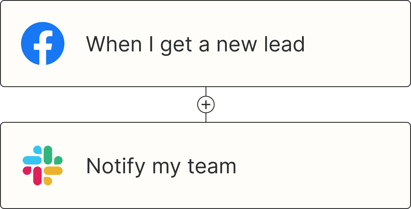
A Zap with the trigger 'When I get a new lead from Facebook,' and the action 'Notify my team in Slack'