Wait, is Google really holding a massive Pokémon Challenge? Is Nest really being installed in Virgin America lanes? No, unfortunately not. It's April Fools' Day, the annual 24 hours when the Internet gets goofy.
But there are dozens of companies that use humor 365 days a year. It's ever-present in advertising, marketing and social media, but that's not the chosen venue of the brand comics highlighted in this post. These companies are the ones who make you laugh after you subscribe or unsubscribe to their email newsletter. They're the ones who surprise you when you read the fine print in the footer, the ones who make you smile with that one line of clever copy.
Call it adding fun, being clever, using humor, employing an element of surprise or adding wit, online companies today are constantly finding unique ways to engage their site visitors and customers. And for good reason: humor strengthens a consumer's relationship with their brand.
Forming a Relationship with Software
"Human beings are social and relationship-manufacturing creators," says Kevin Hale, summarizing the psychological and behavioral research he and his co-founders conducted before launching Wufoo.
"We can't help but create relationships with things that we interact with over and over and over again," he says in a presentation. "Whether it's a company, a brand, a tool, a service, equipment, you eventually attribute characteristics and personalities to that object that you're interacting with and anthropomorphize it."
When Hale and his co-founders created their online form software, they aimed to make it something that wouldn't "remind you that you were working in a cubicle," he says. Instead, they set out to build software that people would want to start a relationship with. To do this, they needed to show Wufoo's friendly personality from the start—their homepage and sign-up form had to make a memorable and positive first impression.
"We approached all of our new users as if we were trying to date them," Hale says.
"Designing for Emotions"
Mailchimp is another company that knows how to use humor well. Like Wufoo, they add fun and playfulness to a hefty business app—email marketing software—with the intention of delighting the user.
"Treats and discovery are an important part of the design process in the user experience team that I lead at Mailchimp," Aarron Walter, MailChimp's director of user experience, writes on the Treehouse blog. "We’ve discovered that humor laced into copy, the personality of Freddie the Mailchimp, and many easter eggs tucked into the workflow can transform an otherwise mundane task into an experience that people look forward to, and sometimes even miss."
Walter's authored a well-regarded book on this approach, "Designing for Emotions", and has regularly spoken on the topic. On the Treehouse blog, he ends his guest post with a line of encouragement for those considering employing the emotional design approach.
"As is true in real life, showing emotion in design has real risk. Some people won’t get it. Some people will even hate it. But that’s okay," he says. "Emotional response to your design is far better than indifference."
Using Humor Year-Round
One way Wufoo makes you smile is clever copy on their sign-up form—under password, it reads "Like a secret agent." And when you log out of MailChimp, it's easy to miss but the URL says "see ya later", an element pointed out by the site Little Big Details.
From clever copy found when signing up or logging out, here are 12 ways companies like Wufoo and MailChimp use humor year-round.
1. App Sign-Up
"When it comes to dating, the most important thing about any relationship is that first date," Hale says.
Wufoo's sign-up form uses casual, friendly copy that reflects the personality of their app—form software that is fun, not rigid and complex. Instead of a strict, "We never share your email," they use a calm, reassuring voice: "Don't worry. This info is sacred to us. We won't ever sell or abuse it."
"It's startling how much it makes a difference, that first date, in terms of whether you proceed along that relationship or not," Hale adds
Here at Zapier, where Hale is an investor, you're probably not surprised to see we use Hale's first impression tactic, too. Almost weekly, it results in tweets like the one.
2. Email Newsletter Sign-Up
After subscribing to Photojojo's newsletter and confirming your subscription via email, you're redirected back to a page letting you know "you rule".
"They execute from that point forward just marvelously," Hale says.
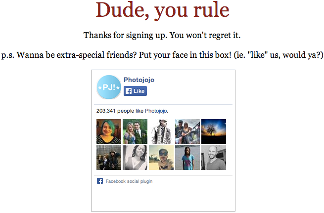
The online photography accessory store also uses a bit of humor to request a "Like" on their Facebook page: "Put your face in this box!"
3. Email Newsletter Copy
In 2010, Groupon showed how clever email copy can make a brand quickly memorable and better yet, affect purchasing decisions.
"A big part of Groupon's success is its editorial voice," Pascal-Emmanuel Gobry of Business Insider wrote when he shared a leaked Groupon copywriting guide. "In a market where there are so few barriers to entry, it's important for customers to trust and love Groupon's brand, and a big way they do that is thanks to the quirky humor of their copy on the deals.
Here's a samle of that copy shared in the New York Times article, "Funny or Die: Groupon’s Fate Hinges on Words":
Today’s modern world, with its plethora of countries, panoply of waterways, and constantly changing laws about what is and what isn’t mail fraud, is as confusing as it is stressful. Get a clear definition of relaxation with today’s Groupon.
Humorous body copy, however, isn't the end of the possibilities in email. Copy elsewhere can be fun, too. For example, Storenvy makes you smile when you notice its newsletter's reply email address:
"please-reply@storenvy.com"
And its unsubscribe text at the bottom assures you, that even if you no longer want to receive their email, they'll still love you:
"You're receiving this email because we love you (and also because you provided your email address when you created our Storenvy account or completed a purchase). If you'd prefer not to receive promotional messages from us in the future, you may unsubscribe at any time. And, don't worry, we'll still love you."
4. Unsubscribe Message
Groupon's email genius didn't stop in your inbox. In 2010, they also earned praise for making you laugh when you attempted to "unsubscribe."
Samantha Gale of the The 60 Second Marketer offers two reasons why Groupon's unsubscribe page worked better than most:
They make the unsubscribers laugh instead of begging them to stick around, which resonates more. Positive reinforcement is almost always more effective than negative; just ask any parent.
Punishing Derrick, as silly as it may be, gives the user a small sense of gratification to make up for the annoyance caused by the emails. This levels the playing field and makes them more likely to resubscribe.
5. Team Page
It's a safe bet you'll find at least a sliver of humor on company team page, especially if their brand can tolerate it—for example, humor is OK for an ecommerce site but not a law practice.
"The About Us page needs to reflect the organization," web marketer Lorrie Thomas Ross told Inc. magazine. "It's the story of how a company started, but it should also be the story of who's behind it. Is the CEO an avid skier? Or a yoga guru?
"We're no longer in the world of B to B, or business to business; we're in a world of what I call P to P, people to people. Relationships are the name of the game. Your clients want to know you, like you, and trust you."
Here are a few companies who put their team members personalities on display.
RJMetrics' about page had a funny face photo exposed on rollover:

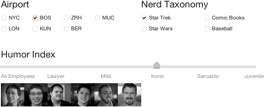
Kayak's team page let you filter down to showcase nerdy characteristics of its team members:
6. Blog
Like the team page, the blog is one of the best spots to show the true colors of a company. But balancing that with informative content for consumers can sometimes be tricky. The folks at online video hosting company Wistia manage to do just that though, injecting random blog posts like "An Ode to Sweet Potatoes", among educational posts, such as "Making the Most of Your Animated Video Production Process.
Wistia's blog is also home to their popular year-end "rap up."
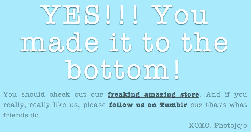
Photojojo's Tumblr injects humor into the footer of the page, employing it as a call-to-action to check out their online store.
7. Load Screen
Online games and mobile apps have become adept to creative loading screens as it's an unfortunate part of their experience. Load times for online web apps, however, aren't typically as long but they're noticeable. Adding humor to break up the time can distract the user make it pass quicker.
At Zapier, we employ this technique when a user is creating an integration. Instead of using "Loading…", we use copy such as "Releasing the carrier pigeons" and "Knocking on Facebook's door".

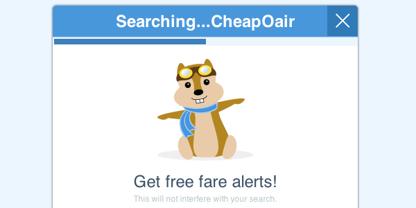
Hipmunk, similarly, animates their hipchunk mascot on their load screen rather than using a standard spinning wheel.
8. Success Screen
After a user has completed a task or successfully used your product, there's an opportunity to give them a virtual high-five. Conference calling software Speek does this by letting you know the time that you spoke was "the best" part of the call.

9. 404 Page
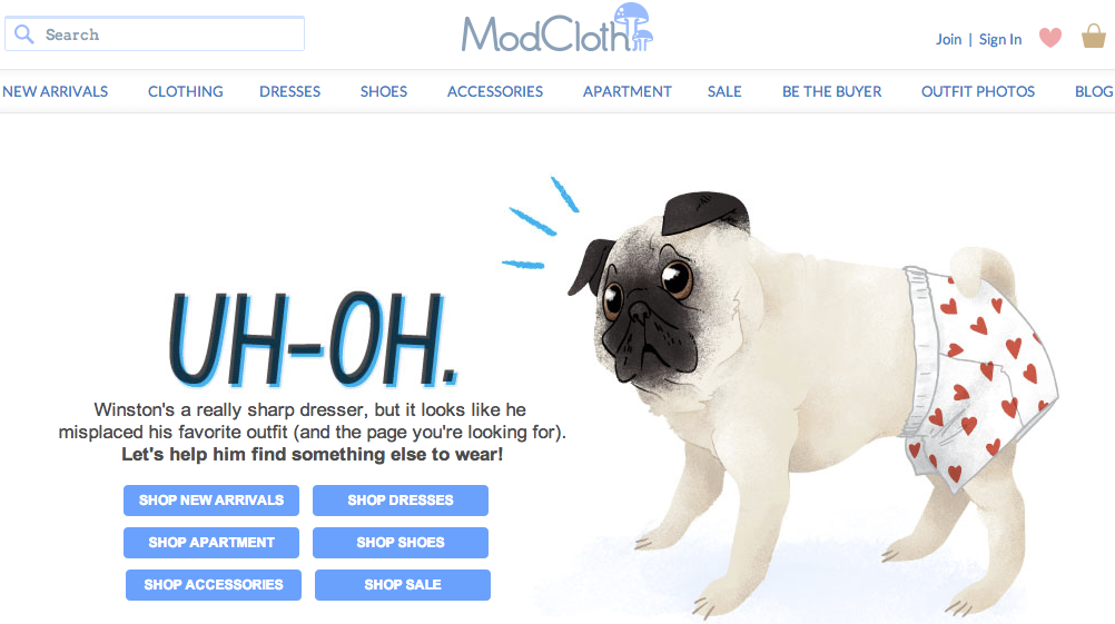
Creating a clever 404 page is now somewhat of a quiet competition among companies. There's a site dedicated to 404 pages and BuzzFeed is just one of dozens of outlets to make a listicle of their best finds.
9. Search Results
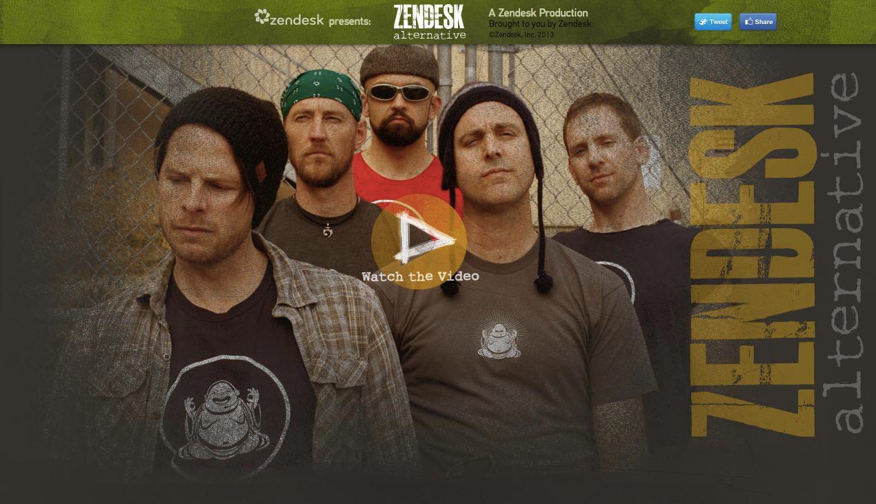
Predicting what potential users will search for, customer service software maker Zendesk created a clever website that stands out in search results: Zendesk Alternative, "one of the original Seattle alternative rock bands."
10. Easter Eggs
Like 404 pages, adding a unique Easter egg (a small element of surprise) is becoming a quiet competition, as well. Lists of "best Easter eggs" are plentiful, but here are a few as examples.
If you go to Wistia's team page and type "dance", they dance, an Easter egg pointed out by Meghan Keaney Anderson of HubSpot.

Kickstarter's footer has a seemingly random scissors icon.

But clicking the scissors three times makes the bottom of the page fall off and you're left with a prompt to sign up for a newsletter.

11. Contests
In Wufoo's early days, the team shared a collective interest in Medieval Times. When they decided to do a contest around putting to use their new API, they chose a prize that fit their personality and they felt would be memorable: "a friggin' battle axe".

"The word of mouth and marketing for this was crazy," Hale says. "We spent almost no money is spreading the word out there, but it spread on its own." The result: 25 submissions, including mobile apps and a WordPress plugin.
"We could not have spent the amount that we paid for the programming contest, or in the amount of time that we had set up the contest had all of these things made," Hale says.
Des Moines, Iowa-based payments startup Dwolla took a tip from Wufoo's book when it held its Old MacDonald Hack Day in 2012. The prize: a cow.


