• Home

  • Business growth

  • Business tips

Business tips

8 min read

How to choose a website theme for your business

Where to start—plus a few things you may not have considered

By Christian Coulson · April 12, 2021
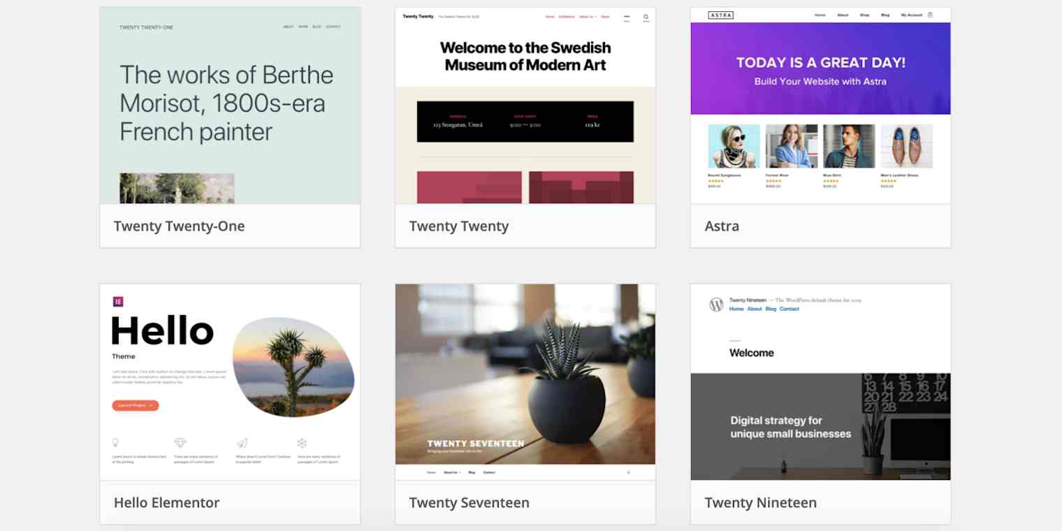
Hero image with various WordPress themes

They say you shouldn't judge a book by its cover, but that's easier said than done. It takes only 50 milliseconds for visitors to form an opinion about your website and decide whether to stick around or click away. 

Assuming you're not a professional website designer, you're going to rely on your theme and template to help you create a professional, trustworthy, and appealing design. Here I'll walk you through how to make this happen, so you can choose a theme that leaves your visitors wondering where you've been all their lives. 

Why your website theme matters

When choosing a theme for my first website, all I cared about was finding one that looked professional. I wasn't aware of how much a theme could affect other things like my website speed and security.

  • Website speed. Poorly-coded and all-in-one themes tend to add tons of unneeded code and features, which can increase your theme's size and load time significantly. This is important because Google uses site speed and user experience as a ranking factor. Plus, no one's going to stick around if your site takes more than a few seconds to load. 

  • Website security. When it comes to securing your business from attackers, your theme is one of the things you should pay close attention to. Themes that aren't updated regularly to fix vulnerabilities are often an easy target for attackers. 

WordPress theme vs. template

When it comes to design, the words "theme" and "template" are often used interchangeably. But in the WordPress world, they mean different things. 

A theme is the foundation for the complete design of a website. This includes things like typography, color palettes, headers and footers, backgrounds, and page layouts. You can think of it as a newly-built house with a fixed number of bedrooms, some bathrooms, a kitchen, and built-in power outlets—but without any furniture, appliances, or decoration. 

For example, here's what the Generate Press theme—which is the one I use for all my projects—looks like out of the box.

The GeneratePress theme out of the box

As you can see, it's pretty basic. And this is what most themes (those newly-built houses) will look like after you first install them. At that point, you'll have two options:

  1. Install a page builder or Gutenberg Blocks plugin to start designing your website, which would be like visiting a home improvement store, buying all the furniture, appliances, and decor you need, and putting everything the way you want it back at home.

  2. Use a pre-designed template, which would be like hiring an interior design company to do all the work for you.

For example, here's what some of the pre-made templates for GeneratePress look like.

The GeneratePress templates

Remember, even if you hire an interior design company, you can still change things around later. This is the same with your template: if you use a pre-designed template, you can still customize it, but it will require less work since everything is already there and in good shape.

Where to find WordPress themes

While there are several places you can look for WordPress themes, the most common ones would be the WordPress.org directory and the theme developer's website.

The benefit of the WordPress directory is that those themes all pass an initial review and quality standards before being listed. This doesn't mean that all of the themes are great, but it's a good baseline.

As you can imagine, there are so many themes that if you wanted to try all of them, you'd never launch your business website. When it comes to narrowing your search, here are a couple of things I recommend:

  • Use the Popular tab on WordPress.org. This will show you the themes that most people love and trust.

  • Search for "best WordPress themes" on Reddit. What I like about Reddit is that you get authentic feedback from actual users.

I know it's tempting to look for themes that have the design you want, but as mentioned earlier, most themes won't look like what you see on the images or preview mode after installation. The sites listed are just demo sites, meant to show off what you could do with the theme.

Think of demo sites as show houses or display homes. These houses typically have custom-made doors, crown molding, and expensive furniture to make them more appealing to buyers, but the company won't include any of that in the actual unit you purchase. It would be up to you to make it look like the show house.

For this reason, once you've found some popular themes on WordPress.org and/or recommendations on Reddit (or other forums), you should visit the actual theme's website and see if they have a templates section. If they do, you'll typically be able to install any of those pre-designed templates with one click.

How to choose a theme for your website

With all the options, how do you go about choosing the best theme for your website? Here are the factors I considered before choosing mine.

1. Design

Most themes will have a templates library, where you can search for pre-designed templates that suit a variety of business types. For example, if you had a nutrition business, you could search for "fitness" or "health and wellness" templates.

When looking at the templates, make sure that you choose one that supports your goal. For example, if you're a photographer, you can choose a template that displays some of your best photos in the header section.

Will Wittmann has a unique design that displays the menu on the left instead of the typical bar at the top and allows visitors to scroll horizontally to see his photos. You can find templates similar to his made by Artisan Themes.

A screenshot of Will Wittman's website

Liz Pinto is another photographer, who focuses not only on photography services but also on selling courses. Since she offers more than just photoshoots, she has a section on her homepage that displays everything she can help you with. 

A screenshot of Liz Pinto's website

The purpose of your business site should be to help users find the information they need and achieve their goals. To do this, it's better to keep things simple and clean, without too many animations or complicated designs.

A great example of this simplicity can be seen over at Papaya, a company that focuses on affordable online tutoring for middle school, high school, and college students. One of my favorite things about this design is the amount of space between elements. 

A screenshot of Papaya's website

Of course, things are different if you're running an eCommerce store. Jonna Jinton has a full-on eCommerce store where she sells handmade jewelry, photo prints, and original artwork. She uses a minimalist shop design with a focus on product images. Simple with no distractions.

A screenshot of Jonna Jinton's website

I would also recommend checking what big businesses in your industry are doing. Typically, these businesses have spent more time, money, and resources testing different designs to find what works best. This doesn't mean that you should copy what they're doing—you just want to look at their choices and figure out which aspects could work for you.

A few things I've noticed from bigger businesses is that their websites tend to:

  • Keep things clear and simple

  • Add a lot of white space

  • Make it easy for visitors to navigate

  • Include one clear call-to-action above the fold

2.  Compatibility with plugins

A plugin is a piece of software you install on your website to give it extra features or functionalities. For example, I have a plugin called Fluent Forms that allows me to add contact forms on my site so potential customers can message me. There are plugins to help you build membership sites, add photo galleries, speed up your site, and more.

Most popular themes should not have any compatibility problems with plugins. But if there's a specific plugin you need for your website—let's say WooCommerce—you can visit the theme's site and check their features to see if it's compatible. If you can't find any information about it, try searching their support forum or contacting the developer.

If, while searching the forum, you find people mentioning compatibility issues with a certain plugin, you want to make sure to check the reviews of the plugin itself. This is because compatibility issues could be caused by a poorly-coded plugin and not necessarily the theme. If you see bad plugin reviews and a lot of complaints about compatibility with different themes, then the problem might be the plugin and not the theme you plan on using.

A good way to reduce the risk of compatibility issues is to choose a theme that isn't marketed as "all-in-one." These types of themes try to do everything themselves and might not work properly when you try to add something else. And even if they do work, they might not do it as well as a focused plugin would.

3. Fast loading times

My first theme had my website loading in about 4.7 seconds, which is a bit longer than what's recommended. After switching to GeneratePress, my loading times went down to under 1 second. Speeding up my website not only helped bring down my loading times but also decreased my bounce rates and increased my conversion rates.

One of the easiest ways to test a theme's speed is to visit their website and look for their demo site. Once you've got the demo site, simply run the URL in GTMetrix or a similar tool to see its load time.

Another thing I like doing is checking the number of requests and amount of data transferred. To do this, you'll have to install a copy of the theme you want (it could be the free version) and test it out of the box.

Once you install the theme, visit your website > right-click anywhere > Inspect element > click the Network tab > reload the site > check the number of requests and amount of data transferred on the bottom-left of the window. 

A screenshot of finding load times for a site

Ideally, the number of requests should be under 20 and the data transferred under 1 MB.

4. Up-to-date development

A good theme developer will consistently update the theme to keep up with new technology stacks, adapt to Google SEO trends, and quickly fix known vulnerabilities to prevent hackers from getting into your site.

One way to check how active the developer and its team are is to type the name of your theme + "GitHub" into Google and scroll down until you find the changelog. Here's an example of the changelog from GeneratePress.

A changelog from GeneratePress

As you can see, there's good documentation of everything that's been happening with the theme. The team is constantly adding new features, fixing issues, and tweaking things.

5. Responsive design

Mobile traffic is increasingly important, and it will increase drastically if you're using a platform like Pinterest to drive traffic. For example, about 61% of the traffic to my fitness site comes from Pinterest, which bumps my mobile traffic to about 80%. That means you need a responsive website that looks great on desktop, tablet, and mobile.

Mobile traffic to Christian's webpage

A responsive theme will allow visitors to:

  • Easily read text without having to zoom in or out

  • See the entire page without having to do any horizontal scrolling

  • Click navigation buttons without an issue

Luckily, most themes should be mobile-responsive by now, but a good way to check is to simply use Google's mobile-friendly test tool.

Mobile website test

Get it up and running

While you want to make sure that your business site looks clean and professional, you don't want to spend several months trying to make it look perfect. When launching my first site, I made the mistake of wasting too much time on design—time that could have been better spent writing content, developing marketing strategies, and focusing on growing my business. About a year after launching my site, I ended up redesigning it anyway. And guess what? I'm looking to change things up again.

Get productivity tips delivered straight to your inbox

We’ll email you 1-3 times per week—and never share your information.

tags

Related articles

Improve your productivity automatically. Use Zapier to get your apps working together.
Sign up
See how Zapier works
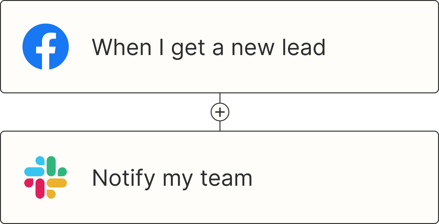
A Zap with the trigger 'When I get a new lead from Facebook,' and the action 'Notify my team in Slack'