• Home

  • Business growth

  • Business tips

Business tips

12 min read

5 Myths About User Onboarding (and What You Should Be Doing Instead)

By Marissa Daily · April 9, 2015
user-onboarding-myths primary img

The Department of Motor Vehicles (DMV) has a terrible user onboarding experience.

Say you need a new driver's license. You arrive at the DMV. You pick a number. Someone shouts at you, "Hey, you need to fill out that form before you pick a number!" You grab the form and pull a pen and clipboard off the shelf. The pen is dry. You pick another one. You complete the form and then you wait. And wait. And then you're directed into a back room where you're drilled with questions, commanded not to smile, and then finally handed the personalized piece of plastic you came for.

Of course, we don't often think of "user onboarding" in offline scenarios, but it's a helpful way to demonstrate a poor experience.

The best way to onboard new users online, however, is a debatable topic. For example, should we rely on tooltip tours?

Tooltip example

Do we need to build a wizard?

Wizard example

When should we ask for app permissions?

App permission example

To settle these questions once and for all, we spoke with user onboarding expert Samuel Hulick. He's literally written the book on onboarding—it's called "The Elements of User Onboarding"—and he's regularly interviewed on the subject. His specialty? "Teardowns," or screenshotted rundowns of what a new user sees with when signing up for an app or service, such as Evernote, Pocket and Buffer.

Evernote onboarding teardown

Those are some of the better ones: there are a lot of apps with ineffective onboarding, seemingly because onboarding myths abound. With Hulick's help, we tackled five of the most significant user onboarding myths.

Myth 1: User Onboarding is a Feature You Roll Out Once and Forget About

Companies often say, "we're rolling out onboarding next month" or "we re-did our onboarding." Hulick strongly discourages this mindset because it limits understanding of the components of onboarding.

He sees user onboarding as a long-term philosophy on how you interact with a user. It's not a crash-course for your product or service—it's the process of helping people succeed with your product.

So where do you start? Hulick says the key is to understand the user and what he or she is trying to accomplish. Do this by paying attention to the areas where users seem to be running into snags or having repeated issues (whether it's during the sign-up process, or three years down the road).

"If I had to recommend one thing to start onboarding on the right foot, it would be to really steep yourself in understanding what it's like for someone to go through your current set-up experience," Hulick says.

Look at your product as if you'd never seen it before. What might be confusing? What information is missing? Is your home page intimidating and complex? Is your sign-up process straightforward? These are all questions that can help you better understand what it's like to use your product for the first time.

If onboarding is a learning curve and not a feature, you really can't just "ship it" and be done. Your user onboarding experience should improve and change with your product. As your product changes, your onboarding experience should, too.

Hulick also suggests tuning into how highly engaged users complete a specific task—such as personalizing an account—and then crafting your onboarding recipe for new users around the successes of your active users. Hulick warns, however, that there's no perfect way to do this. "I would be really hesitant to say, 'Everyone should make sure everyone does X.' It's going to be a lot more about what needs to happen for people to get value out of your product."

Myth 2: Following Effective Steps of Another App Ensures User Onboarding Success for Your App

One of the main points Hulick emphasized during our interview was that user onboarding is different for everyone. There's no one-size-fits-all method—that's why it requires so much thought.

Rather than blindly copying an onboarding experience that appears successful, Hulick suggests adopting a culture of experimentation. Drawing inspiration from other products can prove valuable, as long as the onboarding process created as a result is not a mere copy.

After all, it's difficult to determine what's "working" from the outside. Unless the company publishes an account of their ROI or can say without a doubt that their onboarding experience generated X amount of users, there's no proof that their version is successful.

Experimentation can, however, lead to unexpected results. When online brain training company Lumosity decided to rethink their onboarding process, they added a survey at the beginning of their sign-up process in hopes of better understanding the expectations of new users. They assumed that registration rates would decrease as the sign-up process got longer.

Luminosity onboarding questions

In a sense, they were correct: The five pages of questions did discourage some users. But the Lumosity team also discovered that people who made it all the way through the survey became more valuable users. From the beginning, these were people who were willing to invest time into the product and who then became long-time or paying users.

The end result, as Lumosity's director of product design Sushmita Subramanian explained at First Round Capital's Design+Startup event, was that "more users signed up without the survey, but those who took it ended up subscribing at a 10% higher rate."

Hulick also points out that the "success" of your onboarding experience should be measured for effectiveness. In other words, no matter how pretty or straightforward it looks, if you aren't getting the results you expected, there's probably room for improvement. Users are your best source of information: find out what's not working for them, and how you can improve in those areas.

Myth 3: User Onboarding is Teaching People the Basics of How to Use your Product

Getting people from point A to point B (e.g. from "not signed up" to "signed up") doesn't make them successful users. Likewise, learning how to use a service or navigate a website doesn't mean the user will ever come back to use it again. He or she may complete the full sign-up process and even click through the tooltip tour, but never log back into the app.

Hulick likes to say that onboarding isn't about getting users, it's about getting them back. Somewhere in the process of being introduced to the product, the user makes a subconscious decision about what kind of a user they're going to be. That decision is highly contingent on their onboarding experience.

Hulick says people often mistake onboarding with creating a walkthrough that asks for first name, last name and email address. The real purpose of onboarding should be to get people to come back to your website—new users have little value, otherwise.

"The whole point—and the measure of a successful onboarding experience—is someone being able to find value in your product and coming back and continuing to be a highly engaged and successful user," Hulick says. "It's important not to mistake activity for accomplishment."

That means onboarding reaches a far greater scope than simply implementing a tooltip tour. In fact, Hulick points out several weaknesses in tooltip tours. He puts himself in a new user's shoes, and imagines finally signing up for a new service: the user has likely been thinking about signing up for a long time, but when he finally does, instead of facilitating immediate use of the product, a tooltip tour halts him in his progress.

"It's mind-boggling to me that people are like, 'Okay great! First, don't do anything for the next couple of minutes and just click 'next' over and over!'" Hulick says. Interrupting a new user's momentum doesn't seem very logical, when you put it that way.

Tooltip onboarding example

Tooltip tours also heavily rely on the user's rote memory, assuming that people will remember everything explained during the tour. (Yeah, right.) Hulick, on the other hand, is a proponent of discovery by exploration. He believes that users will adapt to something new much more quickly if they're actually doing it, not just reading about it.

Another tooltip tour flaw? Typically, tooltip tours disappear after the first time you go through them. What if you need to remember where that one pesky little button is, two weeks down the road? It's gone. "It's giving you a bunch of information that's not relevant to you in the moment and then when you do need it, it's not there," Hulick says.

Despite the downfalls of tooltip tours, they're not inherently bad. It all comes back to testing your onboarding for ease of use. If users are finding your app's tooltip tours engaging and helpful, then they're working. User onboarding isn't a cookie-cutter art form, and determining what works for your users is a big part of making it successful.

Tooltip tours aren't the only option for teaching users the ins and outs of your website. Hulick encourages employing a method similar to Slack's, and teaching the user how to use the product by actually letting them use the product. Slack is a team chat and collaboration tool. To set up your account and understand how to use Slack, you chat with the product.

Slack onboarding

Instead of supplying the user with a form to fill out, the Slackbot—think Clippy, but much less annoying—asks the new user for his or her name. In the mere seconds it takes the user to enter his name, he's officially "used" Slack for the first time. This has value not only because it creates a sense of simplicity and ease in using the product—the "oh, I can do this!" factor—but also because it provides value for the user right away. By immediately letting him use it, Slack is letting the product speak for itself and demonstrating its own value. As Hulick so aptly put it: "Slack wins."

Myth 4: User Onboarding is About "Pushing" Users Towards Features You'd Like Them to Use

Hulick says acquiring customers can be approached two ways:

  • A business-centric point of view: the user is a tiny element of your overall business model and your overarching goal is to increase the amount of people using your product. The question is: "How do we get this person to sign up at all costs?"

  • A user-focused point of view: the user is central to your overall business model and your overarching goal is to meet his needs. The question is: "How can we position ourselves to be as helpful and consumable for the customer, as opposed to us consuming the customer?"

With that in mind, Hulick warns against looking at users with the intention of "pushing" them towards anything at all, and strongly suggests replacing that terminology with "helping." The key to successful onboarding—and ultimately to a successful product—is aligning your goals with the user's goals.

"When the way you view your relationship is out of alignment with the way the other party views it, that relationship is in severe jeopardy," Hulick writes on his website. He explains that companies often seem to make the mistake of seeing customers as a small part of their business rather than their business as a small part of the users' life. For example, when Hulick first signed up for email marketing service MailChimp a few years ago, his overall goal was to grow an audience using email marketing. MailChimp, although crucial, was only a part of that endeavor.

Hulick also finds it crucial to remind people who come to him for advice on onboarding that their primary goal should be to create something that's useful to people. That doesn't mean you shouldn't have goals in mind for your users, but remember that your goals should align with their goals.

Thinking this way helps re-evaluate how many hoops you require the user to jump through. Do they really need to give you their birthday or phone number right away? Is uploading a picture necessary to their immediate success? Will it help them reach their goal, whatever that may be?

Think about when you should ask for things like app permissions, because timing is everything. For example, an immediate request for access to the user's camera might be met with suspicion. But what if you wait until the user is about to take a photo within your app to prompt them with the request for access? All of sudden, the user understands why he's being asked for camera access, and understands how he benefits.

Foursquare app permission

Hulick compares this to giving a dog a pill wrapped in bacon. "Anytime you're really trying to get users to do things, if you can wrap it in the bacon of, "it's in your interest to do this" you're gonna find a lot more agreement from your user base," he explains. If your onboarding experience seems logical to a brand new user, chances are you're doing something right.

Myth 5: Onboarding Doesn't Have to be a Personal, Human Experience: It's All About What Happens on your Screen

According to Hulick, this is where onboarding can really go sour: when companies forget that they're dealing with real people. Effective onboarding entails having a 360-degree view of how your product integrates into the user's life.

Hulick compares this facet of user onboarding with the time he bought a charcoal grill in hopes of becoming a great outdoor cook. The grill came with an instruction booklet and an assembly guide which made putting the grill together easy. But what if it had stopped there? Would assembling the grill—"activating" it—be enough to make Hulick successful in using it?

Probably not. But the grill company, Weber, took extra steps to ensure that the new grill owner would succeed in flipping the first burger. They had a website packed with cooking guides, how-to videos, useful accessories. "They helped me 'activate the grill,' but it was really getting me to be better at cooking outdoors that was the substantial improvement to my life," Hulick says. Weber provided a comprehensive collection of resources that helped the novice griller attain his ultimate goal—not just the immediate goal of putting together a grill.

Onboarding should be about improving the customer's life as much as possible. Hulick says it like this: "People don't buy products, they buy better versions of themselves." Whether it's signing up for a newsletter, becoming a gym member, or buying a new phone, the consumer's purchase is backed by the belief that this purchase will, in some way, enhance her life. She's not buying it just to buy it, she's buying it because she thinks it will make a difference for her.

People don

When a new user signs up for your product, she's trusting that you're a crucial part of the solution she's looking for. If you can't imagine scenarios that would cause someone to sign up for your service or acquire your product, it may be difficult to help them become successful users.

User onboarding also happens in different places. It's not just helping the user be successful, it's being aware of what exactly needs to come into play for the user to be successful. One of Hulick's favorite examples of comprehensive onboarding is creating a PDF for employees to send to their superior or boss, explaining the benefits of the product. Since many companies require employees to get permission to justify signing up for a new service or spending money on software that isn't seen as indispensable, creating a resource like a PDF encourages potential users to take the leap and ask for permission. Taking different aspects of the user's life into account leads to a more comprehensive, personal view of what they're trying to accomplish with your service, which in turn leads to a more effective onboarding experience.

Hulick says "human" user onboarding is the most compelling type there is. But how do you convey humanity on a screen? Here are some of his recommendations:

  1. Think small - Details make a big difference. Hulick remembers seeing a tiny birthday cake icon next to the field asking him for his birthday when he was signing up for a new product. Instead of being focused on the personal information he was being asked for, Hulick's attention was deflected on the birthday icon, which invoked positive feelings (yay, presents!). This kind of attention to detail shows the user that you've put time and effort into creating your product.

  2. If you wouldn't say it in person, don't put it on your website - Use slang! Add a touch of humor! Hulick's rule of thumb? Think of your screen as a conversation with the user, only your side is pre-recorded. If you'd say "Howdy, welcome to ____!" in real life, put it on your website. Personality can be present everywhere: from error messages to confirmation pages. "If your website isn't saying what you yourself would say, that's probably a really big area of opportunity for you," Hulick says.

  3. Be consistent in tone - "Whatever would work for a human being should be applied to your software," Hulick explains. If your company's marketing copy has an approachable, relaxed tone, your error messages should reflect that tone (don't just flash "Error 34768 report to server" on the screen). Being consistent across your platform helps the user feel like he's dealing with a person rather than an unresponsive web element.

Beyond the Onboarding Experience

Hulick also points out that companies seem to shy away from lifecycle emails, a mistake he believes is due to the fear of being spammy. "It is completely possible to send emails that people actually like getting that are genuinely helpful and pleasant and cheerful, and I really recommend not disregarding that entire category because some people do it like creeps," he says.

Lifecycle emails encourage users along a path of progress and can significantly increase their likelihood of going back to the product again and again—their inbox is literally reminding them how great your product is and why they should use it again. Hulick considers email marketing to be hugely underused in onboarding processes, and explains that as long as your emails provide real value to the user and aim to help him in some way, you'll avoid being spammy.

Keep it Simple: Focus on the User

After reading all of this, you may be thinking, "So onboarding is all about the user—but what about, you know, making money?" Hulick emphasizes that focusing on the user is actually the smartest business decision you could possibly make. Onboarding can be the push that turns your "just browsing" customers into paying ones. If your onboarding process is top-notch, your users will come back and continue using your service. They might even start recommending it to their friends, co-workers, or boss. Happy customers generate more happy customers.

Psst, want early access to Samuel Hulick's new user onboarding project? The details are top-secret, but you can apply for the beta now.

Welcome photo courtesy of arbyreed via Flickr. Appboy onboarding wizard courtesy Appboy.

Get productivity tips delivered straight to your inbox

We’ll email you 1-3 times per week—and never share your information.

tags

Related articles

Improve your productivity automatically. Use Zapier to get your apps working together.
Sign up
See how Zapier works
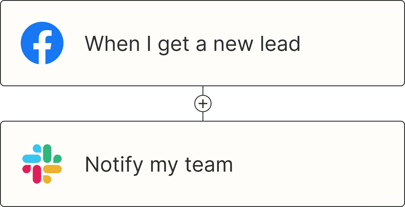
A Zap with the trigger 'When I get a new lead from Facebook,' and the action 'Notify my team in Slack'